by Gary Stevens | Jan 18, 2019 | Content Strategy, ECommerce, Web Content
Online buyers have many choices when it comes to products or services. If you’re an internet retailer, then you want every advantage to gain more sales. In that regard, video can be crucial to converting online traffic to revenue.
In their recent, annual video marketing survey, Wyzowl surveyed 570 professional marketers and online consumers. Of this group, 76% reported that website videos generated more sales.
A Liveclicker survey of retailers noted a significant increase in average order value (AOV) on product pages that contained videos. As well, 57 % of retailers who used video witnessed a sales increase of 50 percent on their products.
This marketing trend is valuable intel to businesses and will continue to be strong in 2019. Whether the video is animated, featured in a header, or used for a sales campaign, the results from marketing with video have been shown to attract more revenue.
Here’s how video converts online visitors into paying customers.
1. The Video Hook
One of the most valuable steps to a video campaign that is going to generate online sales happens in those first few seconds. Folks are just not going to stick around without having their interest piqued. Like a well-written article, a video needs a solid hook.
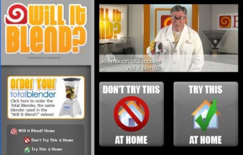
One of the most famous marketing video series begins with the zinger, “Will it blend? That is the question.”
The blender company, BlendTec, offers a unique hook that makes customers curious about their remarkable, sturdy kitchen blenders.
Following the hook, founder Tom Dickson proceeds to blend anything imaginable, including cameras, marbles, and even an iPhone playing the series’ intro. This innovative marketing strategy has resulted in viral videos, with millions of views and the lion’s share of the kitchen blender market.
2. Video Length: The Short and Long Game
Online shoppers make quick decisions. For them, there is great value in a short video that highlights the product in a simple and clear fashion. However, some shoppers may bite on a longer video when contemplating how their lifestyle fits with the company’s mission, brand, and products.
Short for Sales
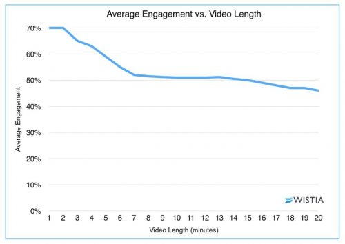
Short, short, short. For sales, it’s often best for the video to come in under two minutes.

Video software company Wistia reports that two minutes is often what companies need to shoot for. Videos that sneak past the two-minute mark show a significant drop-in engagement.
For short videos, a good strategy is to be concise. Be clear on message. Don’t try to do too much. Though the business or retailer wants a sale, the mission is just as important to feature as the product. Even in a short video, the customer is buying into the company as much as the product itself.
Long for Brand
While short is often essential to sales, that is not always the case for engaging customers with your brand, which is why long-form videos have their merits.
Businesses interested in showcasing their brand or a particular message may not be able to do that visually in 120 seconds. It may be necessary to craft a longer narrative. In that case, you want careful planning and a proper budget.
Longer videos can result in more shares and views, which is the result of a 2017 study by Wochit, a leader in video platform. More shares and more views can ultimately lead to more revenue. Paul’s Boots and Patagonia are great examples of using the long-form video to attract consumers and reinforce their brand.
In their “Worn Wear” video, Patagonia takes the viewer and/or potential customer on a journey of experience and aspiration. With breathtaking outdoor scenes and rich stories about rugged individuals who care about the earth, their video is targeted directly at these interested consumers, and even new ones, who want the same journey, lifestyle (and that awesome outdoor wear!). You may be surprised at how quickly the twenty-eight minutes passes.
3. Videos Can Be Fun (and “Quality” is Negotiable)

BlendTec’s “Will it blend?” series were not high-quality at the onset, and they didn’t need to be. For videos showcased on social media sites, small businesses in particular can get away with off-the-cuff, down-to-earth feel of a low-rez video. And this is what BlendTec did in the mid-2000s.
Many SMEs can have a lot of success like BlendTec by crafting fun videos that don’t require a large budget. Small businesses can shoot on cell phones without expensive light kits or a boom mic and DAT recorder taking in the sound.
An often overlooked part of the video equation is the value of knowing which web hosts can handle large amounts of traffic. Whether you end up with a flashy, high-dollar mini-movie or a low budget infomercial, you need a host and plan with the computing resources available to push it out to viewers quickly and without fuss.
Even low quality videos are an enormous bandwidth drain. If yours don’t load fast enough, thanks to a below-average host, expect potential viewers to click away as fast as they arrived, leaving all your video efforts to amount to squat. The bottom line is that all hosts are not created equal so exert some effort to find a good one.
4. Video Creation and Editing
Given the video capabilities of phones (the 2015 feature film Tangerine was shot on an iPhone), marketing videos can be created in-house with a decent look.
Also, with the ease of some basic video-editing software like Lightwork or DSVC, these videos can be edited with ease.
A small business does not necessarily have to hire a media company to shoot video though it is recommended if there is a budget for it.
Most iterations of the iPhone produce extraordinary video quality. As well, Apple offers their iMovie software, where you can edit on phone or Mac.
Offering free and paid versions, Magisto is another type of software that allows for shooting with a phone and editing within its interface. Magisto specifically targets users wanting to upload social media videos.
[Update Nov. 18, 2019] Resources like this one (How to make a promotional video for your company: 7 steps) may also help.
The Bottom Line
With a solid marketing strategy, video creation allows businesses, small and large, to grow revenue and gain more online sales. For large firms, this can be more high-quality videos or storied films about their brand and products. But even small business can get in on the game with video by grabbing more average order value (AOV) simply by posting product videos with heart and humor.

by Harshala | Dec 28, 2018 | Content Management Systems, Content Strategy, Industry News, Web Content, Web Design, Web Development
What is a static website generator?
A static site is a collection of pages contained in basic HTML files. A static site generator is a compromise between using a hand-coded static site and a full CMS. You generate an HTML-only website using raw data such as Markdown files and templates. The resulting build is transferred to your live web server.
An Introduction to Static Site Generators article was published a few years ago. The basic concept has remained constant. It explains the popularity of static site generator. It also help people of all skill levels understand exactly what static site generators are, acknowledge their advantages, and understand if their limitations are a deal-breaker or if, on the contrary, they can be overcome.
How static sites work?
The proposition of a static site is to shift the heavy load from the moment visitor’s request the content to the moment content actually changes. Using a news kiosk metaphor, think of a scenario where it’s the news agencies who call the kiosk whenever something newsworthy happens.

(more…)

by Harshala | Aug 17, 2018 | Content Strategy, Web Content
What is Information Architecture?
Information architecture is the practice of deciding how to arrange the parts of something to be understandable. It is in the websites we use, the apps and software we download, the printed materials we encounter, and even the physical places we spend time in.
A good Information Architecture helps people to understand their surroundings and find what they’re looking for – in the real world as well as online. Practicing information architecture involves facilitating the people and organizations we work with to consider their structures and language thoughtfully.

Information architecture (IA) focuses on organizing, structuring, and labeling content in an effective and sustainable way. The goal of IA is to help users find information and complete tasks. To do this, we users need to understand how the pieces fit together to create the larger picture, how items relate to each other within the system.
As many students (and teachers) begin a new term this month, we thought it would be helpful to review some of these fundamental tenants. It is always a good idea to focus on the basics and make certain we have a solid foundation.
(more…)

by Harshala | Aug 10, 2018 | Content Strategy, Semantic Web, Web Content
What is Semantic Markup mean?
Semantics is the study of language meaning – the words used to communicate. Semantic markup should be used in web pages we create and modify.
In our technology world we use semantic language. Semantic HTML is the use of HTML markup to reinforce the meaning of the information in webpages and web applications rather than merely to define its presentation or look. Semantic HTML is processed by traditional web browsers as well as by many other user agents.
For HTML it is the tags we use to mark a document up. Markup is how a web document is created, or the way you write a document using the language available to you. For most web documents this is still HTML, so it is how you write the content you want to display using HTML.

(more…)

by Harshala | May 18, 2018 | Industry News, Web Content
The Web continues to evolve. Recent projections indicate that virtual reality and augmented reality may soon become a major part of web interfaces. We thought it might be helpful to provide a quick overview of these technologies and provide additional resources about the potential impact on the web. As an aspiring or practicing professional, you should be aware of these technologies.
What is Virtual Reality?
Virtual Reality is the computer-generated simulation of a three-dimensional image or environment that can be interacted with in a seemingly real or physical way by a person using special electronic equipment, such as a helmet with a screen inside or gloves fitted with sensors.
Current VR technology most commonly uses virtual reality headsets or multi-projected environments, sometimes in combination with physical environments or props, to generate realistic images, sounds and other sensations that simulate a user’s physical presence in a virtual or imaginary environment. This Wikipedia article has detailed information about the technology and its applications.
What is Augmented Reality?
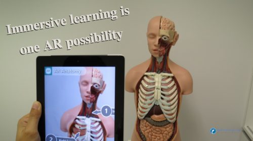
Augmented reality (AR) is a direct or indirect live view of a physical, real-world environment whose elements are “augmented” by computer-generated perceptual information, ideally across multiple sensory modalities, including visual, auditory, haptic, somatosensory, and olfactory. The overlaid sensory information can be constructive or destructive and is spatially registered with the physical world such that it is perceived as an immersive aspect of the real environment. In this way, augmented reality alters one’s current perception of a real world environment, whereas virtual reality replaces the real world environment with a simulated one. Augmented Reality is related to two largely synonymous terms: mixed reality and computer-mediated reality. You can find more information about this at this Wikipedia article.

(more…)

by Mark | Feb 22, 2017 | Web Content, Web Design
This article was written by Junaid Ali Qureshi. He is a digital marketing specialist who has helped several businesses gain traffic, outperform competition and generate profitable leads. His current ventures include Progostech, eLabelz, Smart Leads.ae, Progos Tech and eCig.

Learning web design techniques and tricks is easy. No matter whether you have the right skills or not in the start; by repeating and learning from the mistakes and polishing the weak areas you can easily step up a notch and fall among the highly experienced and professional web designers. The problem that many web design experts encounter here is the challenge to keep up their good reputation and to improve the skills they already have.
Do you have a lot of projects lined up? Every professional web designer does. The real question is whether you have different, innovative ideas for each of them or not? Wouldn’t using the same web design techniques on each project make your style monotonous? This is something every design expert worries about. To help you get through this transitional phase with ease; we have compiled 5 essential tips that help to rejuvenate the web design skills of every expert.
There are several tutorials and videos through which you can learn how to advance your web design skills level; but, every designer needs some instant tips as well. These tips help them achieve goals earlier than expected. One thing is assured; these tips are no shortcut to success but merely the best techniques used by experts worldwide.
The 5 tips that will help you improve your skills are as follows:
- Always sketch a rough design of your web before working with the tools. Have you ever seen an architect work? He lays down all the plans on a sheet of paper, reviews them, goes through them again and again, gets the approval of the client and only then proceeds to the next step. The number one tip here to improve your skills is to adopt the routine of making a rough draft of the website you are planning to develop. Once you have made a rough sketch, you can make changes if needed or move towards developing the final website. If you aren’t comfortable with the pen and paper idea, you can use various prototype building websites and apps to get a view of the rough version of the website.
- Stay in touch with the latest style guides. Make sure you have your own style guide or you follow a well-written style guide to design the web page. This will help you build the website in a uniform fashion. Keeping in view the template of the website and the effect you would like to add or not; you can either improvise the pre-written style guide or make a new one. Try to make an exquisite design that differentiates you from the other competitors in the market. Large font size is in fashion these days. Try to use it in your template and make some space for typography as well.
- Upgrade, expand and re-evaluate your web tools. Web design is not simple at all. You have to use several tools to achieve the effect you are trying to present. It requires using old as well as new tools to bring an innovative idea into a real form. Tip number three states that you need to upgrade your web tools. Make sure you are using the latest version of the web tool and get its updates on regular basis. Add more tools to your toolkit and experiment with new ideas. Only then you can bring versatility to your work. Our company offers new tools and features every now and then. It is the job of the web designer to incorporate them properly into the website using their skills to gain maximum benefits.
- Keep your SEO knowledge up-to-date. We have seen that this tip has been repeatedly offered to the readers on different platforms but the truth is, no matter how much we try to escape it, SEO rules and regulations are the standards that every website has to meet. Thus, strengthen your grip over the SEO guidelines. Use SEO optimized keywords, headings style, high-quality content and other linking features to stay in the game. Practice merging SEO techniques in your work project to revamp your skills to a better scale.
- Pick catchy and original images for your web page. A web page is defined by the images, content and its style. You need to make it perfect to get a better ranking and to impress the clients. Many web designers use free Google images that are available (but that’s old news now). You need to go for the options other than this to improve your skills. Try investing in premium stock images or create an image from scratch appropriate tools. You can also capture high-quality photographs and combine them with your own sketches as well.
As web designers, we are already familiar with all these tips. However, it is always good to review these basics periodically. Make sure you follow them and you’ll see positive results within no time!
