by Gary Stevens | Jan 18, 2019 | Content Strategy, ECommerce, Web Content
Online buyers have many choices when it comes to products or services. If you’re an internet retailer, then you want every advantage to gain more sales. In that regard, video can be crucial to converting online traffic to revenue.
In their recent, annual video marketing survey, Wyzowl surveyed 570 professional marketers and online consumers. Of this group, 76% reported that website videos generated more sales.
A Liveclicker survey of retailers noted a significant increase in average order value (AOV) on product pages that contained videos. As well, 57 % of retailers who used video witnessed a sales increase of 50 percent on their products.
This marketing trend is valuable intel to businesses and will continue to be strong in 2019. Whether the video is animated, featured in a header, or used for a sales campaign, the results from marketing with video have been shown to attract more revenue.
Here’s how video converts online visitors into paying customers.
1. The Video Hook
One of the most valuable steps to a video campaign that is going to generate online sales happens in those first few seconds. Folks are just not going to stick around without having their interest piqued. Like a well-written article, a video needs a solid hook.
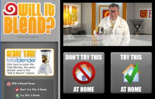
One of the most famous marketing video series begins with the zinger, “Will it blend? That is the question.”
The blender company, BlendTec, offers a unique hook that makes customers curious about their remarkable, sturdy kitchen blenders.
Following the hook, founder Tom Dickson proceeds to blend anything imaginable, including cameras, marbles, and even an iPhone playing the series’ intro. This innovative marketing strategy has resulted in viral videos, with millions of views and the lion’s share of the kitchen blender market.
2. Video Length: The Short and Long Game
Online shoppers make quick decisions. For them, there is great value in a short video that highlights the product in a simple and clear fashion. However, some shoppers may bite on a longer video when contemplating how their lifestyle fits with the company’s mission, brand, and products.
Short for Sales
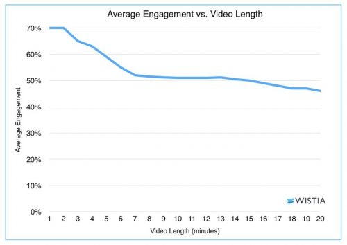
Short, short, short. For sales, it’s often best for the video to come in under two minutes.

Video software company Wistia reports that two minutes is often what companies need to shoot for. Videos that sneak past the two-minute mark show a significant drop-in engagement.
For short videos, a good strategy is to be concise. Be clear on message. Don’t try to do too much. Though the business or retailer wants a sale, the mission is just as important to feature as the product. Even in a short video, the customer is buying into the company as much as the product itself.
Long for Brand
While short is often essential to sales, that is not always the case for engaging customers with your brand, which is why long-form videos have their merits.
Businesses interested in showcasing their brand or a particular message may not be able to do that visually in 120 seconds. It may be necessary to craft a longer narrative. In that case, you want careful planning and a proper budget.
Longer videos can result in more shares and views, which is the result of a 2017 study by Wochit, a leader in video platform. More shares and more views can ultimately lead to more revenue. Paul’s Boots and Patagonia are great examples of using the long-form video to attract consumers and reinforce their brand.
In their “Worn Wear” video, Patagonia takes the viewer and/or potential customer on a journey of experience and aspiration. With breathtaking outdoor scenes and rich stories about rugged individuals who care about the earth, their video is targeted directly at these interested consumers, and even new ones, who want the same journey, lifestyle (and that awesome outdoor wear!). You may be surprised at how quickly the twenty-eight minutes passes.
3. Videos Can Be Fun (and “Quality” is Negotiable)

BlendTec’s “Will it blend?” series were not high-quality at the onset, and they didn’t need to be. For videos showcased on social media sites, small businesses in particular can get away with off-the-cuff, down-to-earth feel of a low-rez video. And this is what BlendTec did in the mid-2000s.
Many SMEs can have a lot of success like BlendTec by crafting fun videos that don’t require a large budget. Small businesses can shoot on cell phones without expensive light kits or a boom mic and DAT recorder taking in the sound.
An often overlooked part of the video equation is the value of knowing which web hosts can handle large amounts of traffic. Whether you end up with a flashy, high-dollar mini-movie or a low budget infomercial, you need a host and plan with the computing resources available to push it out to viewers quickly and without fuss.
Even low quality videos are an enormous bandwidth drain. If yours don’t load fast enough, thanks to a below-average host, expect potential viewers to click away as fast as they arrived, leaving all your video efforts to amount to squat. The bottom line is that all hosts are not created equal so exert some effort to find a good one.
4. Video Creation and Editing
Given the video capabilities of phones (the 2015 feature film Tangerine was shot on an iPhone), marketing videos can be created in-house with a decent look.
Also, with the ease of some basic video-editing software like Lightwork or DSVC, these videos can be edited with ease.
A small business does not necessarily have to hire a media company to shoot video though it is recommended if there is a budget for it.
Most iterations of the iPhone produce extraordinary video quality. As well, Apple offers their iMovie software, where you can edit on phone or Mac.
Offering free and paid versions, Magisto is another type of software that allows for shooting with a phone and editing within its interface. Magisto specifically targets users wanting to upload social media videos.
[Update Nov. 18, 2019] Resources like this one (How to make a promotional video for your company: 7 steps) may also help.
The Bottom Line
With a solid marketing strategy, video creation allows businesses, small and large, to grow revenue and gain more online sales. For large firms, this can be more high-quality videos or storied films about their brand and products. But even small business can get in on the game with video by grabbing more average order value (AOV) simply by posting product videos with heart and humor.

by Gary Stevens | Oct 26, 2018 | Analytics, Content Strategy, ECommerce, User Experience, Web Marketing
Conversion Rate Optimization (CRO) is a fancy term for a dead simple task – getting more of your website visitors to take the appropriate action. Note we said that the visitor’s side of the equation is simple, and it is. All they have to do is sign up for an email list or buy a product or service – whatever it is that is the reason for your site’s existence.
For the rest of us website owners desperately seeking the Holy Grail that will ratchet our conversions up, the task is more complicated, especially if you’re new to the whole art/science/voodoo that is modern CRO.

But you can rest easy. Even if you’re the wettest behind the ears newbie imaginable, we’re about to open up a world of possibilities by presenting the first four CRO tools you should consider as you begin (or continue) your battle to make a buck online. Easy to use but powerful, get ready to have your wildest dreams of profit come true. Just having a little fun there, but you never know…
Why You Should Care About CRO
In case you feeling compelled to dismiss the importance of a better conversion rate, consider the following:
- Higher conversion rate = better ROI
- You can make more money with the same amount of visitors
- It’s the best way to circumvent online impatience from visitors
Achieving these three goals is all in the data and how you analyze it. Let’s get started.
Powerful but with a short learning curve, Hotjar allows you to analyze a website up to 2,000 pageviews a day at no cost. For 10,000 pageviews a day, your price will be $39 a month and it goes up from there. What can you do with Hotjar? Quite a lot, actually.
Features include: polling, surveys, visual heatmaps, conversion funnel tracking, form analytics, visitor recordings, and more.
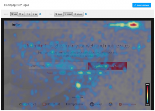
The cool stuff: If you haven’t heard about visual heatmaps, they’re all the rage in CRO conversations. Put simply, they allow you to identify hot and cold spots on your website – in other words, where visitors click and where they don’t. If your prize BUY NOW button is in the deep freeze, a heatmap lets you know a redesign is in order.

Visitor recordings can also be helpful as you launch a CRO strategy. Did you ever wish you could stand behind a visitor’s shoulder and watch as they navigate your site? Being able to see exactly where they got bored, confused, frustrated, or simply leaped up to answer the call of nature would be immensely valuable. That’s what you can do with visitor recordings. Play back the click journey(s) and you’ll soon be able to tell where the process falls apart.
Crazy Egg is definitely a major player in the CRO field. With a generous 30-day trial period and pricing that starts at $39 month, this service allows you a chance to practice before committing actual money.
The cool stuff: The big three offerings from Crazy Egg are heatmaps, visitor recordings, and A/B testing. We’ve already touched on heatmaps and visitor recordings, so let’s define A/B testing, which is a basic but critical part of CRO.
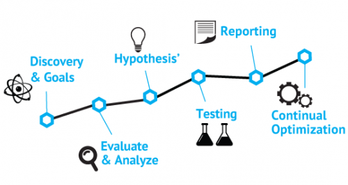
The overall process of CRO is to figure out what isn’t converting on your website and change it. The simplest way to do that is create nearly identical pages and split your traffic between them. Note we said NEARLY identical. By changing one thing at a time on a page, like say the color of the “buy” button, you can compare which version converts better.
By continuing to make one change at a time, you incrementally improve your conversion rate.
While heatmap tools are pretty standard fare with most CRO tools, EyeQuant has taken a different approach. Rather than relying on visitors’ actions to discern hot and cold spots on a web page, this company uses artificial intelligence (AI) to predict the areas that draw visual attention which, obviously, is a precursor (and perhaps more valuable measurement) to action.
The cool stuff: Where heatmaps collect and combine real world site interaction that plays out over time, EyeQuant’s Attention Map lets you upload a snapshot of a web page and delivers the verdict within a few minutes. This almost instant analysis comes to us courtesy of technical AI advances that make an educated guess as to where human eyes will go first.
One thing to keep in mind is that this service seems to work better with e-commerce websites. It tends to automatically decide that text heavy sites are too busy. While EyeQuant’s price might appear to be a state secret, we’ve managed to determine that entry-level packages start at around $100 per month.
As to whether your needs can justify the price – your call – but the case studies are pretty impressive.
The old war horse of CRO is something you’d have a hard time avoiding if you spend much time at all online but just because it’s been around a while doesn’t mean it’s past its prime. Not only has Google Analytics (GA) been revamped in recent years to make it even more valuable for CRO practitioners — it’s free. Included in GA are all the usual suspects of CRO like A/B testing, exit page, behavior flow, and more.

Final Thoughts
An often overlooked part of tuning your website for maximum conversions is how quickly it loads. Everything else being equal, a faster website means higher conversions. You’re doing yourself a serious disservice if you don’t pay attention to this. While we’re not trying to turn you into a programmer, there is a lot to accomplish through a few relatively simple strategies related to file compression.
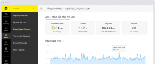
Check out this Pingdom page to find out how quickly your website loads. Keep in mind that Google recommends two seconds or less and even uses this metric as part of its vaunted algorithm that determines where you place in search results. Improving site load speed is an ongoing parallel process to focus on at the same time as you learn to use the CRO tools we’ve discussed here. Good luck!

by Gary Stevens | Sep 21, 2018 | Industry News, User Experience
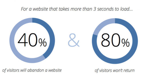
Internet users want a speedy experience and they’re not getting it, a fact that leaves them frustrated and website owners with less revenue. Don’t believe it? Numbers don’t lie. A full 53 percent of surfers want any site they visit load in three seconds or less. The largest ecommerce sites in the world recognize this necessity – they load incredibly fast. Most of the rest of the internet leaves a time gap that makes for a lot of gritted teeth and nervous toes tapping the floor. The good news is that speeding up a slow website is not difficult or time-consuming. The bad news is you might not choose to do it.
Are You Flirting with the Performance Poverty Line?
The performance poverty line is a term that represents the point at which being slow doesn’t matter because you’ve already lost most of your traffic. That number sits at around 8 seconds. The more pertinent question is, do you know your website’s speed. REALLY know your website’s speed?
No guessing because this is important stuff.
There’s an easy way to find out. Pay a visit to a website called Pingdom — it’ll probably load fast because it’s sort of their business — and enter your URL in the box. Select a location from the dropdown menu and hit “start.” Unless they’re exceptionally busy (it happens sometimes) you should get a performance summary in less than a minute.

There’s a good chance what you see won’t impress anyone, but that’s okay. Few websites do. We’re here to provide you with a road map to get those numbers headed down, down, down and your visitors to start getting happy, happy, happy. Let’s call this…
A 6-Part Roadmap to Fast Websites and Happy Customers
Part 1: Magically Shrink Your Website
Actually, as far as we know, there’s no way to magically shrink your website but you can get the same effect by applying a sweet little bit of technology called Gzip compression. When implemented, some site owners have seen overall file size reduction of as much as 70 percent. That’s huge. Actually it’s tiny and that’s the point. It works like this. When a request hits the server to view the website, it automatically zips all the files before sending them onto the requester’s browser, where it is unzipped and displayed.
Part 2: Fix Bad Design and Too Many HTTP Requests
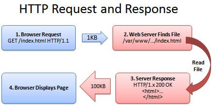
Every element on your website — we’re talking about images, videos, scripts, and even text — generates an individual request to the server. The more “stuff” your website has, the more requests there are and the longer it takes to load. If ever there was an argument for using a minimalistic approach when designing your website, this is it. Fewer requests mean a faster website. The tricky part is to not get distracted by all things you could do and stick to only what is needed to accomplish the site’s mission.

Part 3: Put Hefty Images on a Diet
Images are huge. Incorrectly (or not at all) optimized, they put a terrible strain on bandwidth and leave the server and browser gasping from the strain. While we could write a book on the topic, there is one thing you can do that will fix a lot of the issues and that is choose the correct format — png, gif, and jpeg are good — and make the things as small as you can stand BEFORE uploading to your website. If you upload a full size image, even if you reduce it later, the server still has the original version and that’s the one that clogs the pipeline.
Part 4: Upgrade Your Hosting
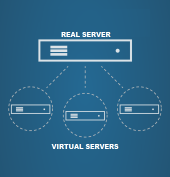
We love cheap stuff as much as the next person but when it comes to choosing a web hosting plan, you need to understand the different types of plans and know when it’s time to upgrade. Inexpensive shared plans can be as low as a few dollars a month and that’s okay for a hobby or site that doesn’t have much traffic yet. Once you reach a certain level, though, the shared resource approach of this kind of plan will almost certainly mean slow-loading and downtime. While a dedicated server might not be worth the expense, a virtual private server or VPS hosting can be a great compromise.

Part 5: Turn on Browser Caching
Browser caching is an easy-to-implement, tactic that most fast-loading websites use. The idea is simple. Rather than force the server to send over all the website files every time someone visits, static files (those that don’t change) are stored in the browser’s temporary memory and only dynamic files have to be retrieved. Obviously, this doesn’t help on a first visit but, with browser caching enabled, subsequent visits will be quicker. For WordPress websites, W3 Total Cache is a free plugin to look for. Others just require a simple code addition.
Part 6: Resolve Plugin Conflicts
This WordPress-specific advice is based on the reality that a lot of site owners install plugins that they never update or even use. Considering the third-party nature of these bits of software, it should be no surprise that they don’t always play nice together — they weren’t intended to. If your WordPress website is slow or buggy, one of the first actions to take is to uninstall any plugins you aren’t using. After that, turn what’s left off one at a time and check site speed. There’s a good chance you’ll find one of the culprits to slow loading.
Final Thoughts
The state of technology today is such that people expect (even if it’s not a reasonable standard) a website to load in three seconds or less. A clean, fast-loading experience will go a long ways towards creating loyal customers and more revenue, which are both good things to shoot for as an online entrepreneur. Keep in mind that the process is iterative. There’s no magic wand that will turn your site into a speed burner. Small actions taken methodically, such as the ones described, should, over time, move you incrementally closer to that three second target. Good luck and thanks for reading.

Member author Gary Stevens is a front end developer. He’s a full time blockchain geek and a volunteer working for the Ethereum foundation as well as an active Github contributor.
