
by Steve Waddell | Feb 11, 2022 | User Experience, Web Accessibility
Web accessibility is the practice of making websites and web tools accessible to as many people as possible, and it is rapidly growing in importance in the world of web design and development. The web levels the playing field for people from all different walks of life and removes barriers for people who may have disabilities and struggle in one way or another in the physical world.
With more people than ever working and learning from home, it is important to make sure websites and web tools are properly designed so that no user is left out. Poor website and web tool design can limit accessibility, often unintentionally. It is up to web designers and developers to ensure the products and services they offer can be easily utilized by everyone.
In addition to supporting people with disabilities, accessibility can include other groups that are often marginalized such as populations in rural areas, populations in developing countries, and older populations. Additionally, improving accessibility is a good business decision as it improves the overall user experience for all users. An increased focus on accessibility can spearhead new product and service offerings as well as expand market share. Once accessibility becomes a priority for you and your organization, it will become an integral part of the design process.

Let’s take a look at some of the most common disabilities, and how smart design can make the web accessible for all.
Cognitive impairments
This group includes people with a wide range of disabilities including learning disabilities and mental illness. The most common issues this group has when using the web are difficulties understanding content on websites and how to navigate complex web page layouts. To help this group, designers can focus on making easily understood content by delivering the content in more than one way, such as text, video, and text-to-speech. Maintaining a consistent web page layout and making forms easy to understand and submit are other ways to ensure accessibility for this group.
Mobility impairments
This group includes people with different disabilities ranging from physical impairments to neurological conditions. Disabilities include difficulties moving a mouse around on the computer screen and conditions that require assistive technologies such as speech recognition. Designing a website that can be fully navigated with just a keyboard can go a long way toward meeting the needs of this group.
Visual impairments
This group includes people with blindness, limited vision and color blindness. To help this group, it is important to include tools with zoom capabilities for websites and web tools. It is also helpful to include screen readers so that users can opt to have the text on the site read aloud to them.
Hearing impairments
This group includes people who are completely deaf or partially hard of hearing. To keep websites accessible for people in this group, make sure all audio content is transcribed and all video content has closed captioning easily available.
Designers and organizations often publish accessibility statements on their websites to provide an overview of accessibility policies and what steps have been taken to improve in this area. This can be a good way to be transparent, and it is also an opportunity to solicit feedback from users about areas for improvement.
The World Health Organization states that over 1 billion people—15% of the global population—have a disability. By not incorporating accessibility into websites and web tools, designers and organizations miss out on a massive number of people who might otherwise be potential users. Accessibility in web design is the right thing to do, makes the experience better for all users, and can help businesses grow worldwide. For more information on web accessibility, contact us today.
Read More: Taking a Look at Cybersecurity

by Steve Waddell | Apr 15, 2021 | Job and Resume Tips from the Pros, User Experience, Web Design, Web Development
People often think that web development and web design is an industry that is only for young people. Many start-ups and tech companies are run by people in their 20s and 30s, so this is a common belief. However, there will always be a need for web developers and designers by companies across a wide variety of industries. If you have the skills and determination, companies will give you a serious look—no matter how old you are. Companies often don’t care about what you have done in the past, so you can learn web development and show companies that you can help them meet their goals—even if you are switching from a completely different industry. If you are in your 40s, 50s or older and thinking about taking the plunge in learning web development or design, here are some tips to keep in mind during the process:
Identify Your “Why”
If you can identify why you want to learn web development or design skills, and have a goal in mind, you will be much more likely to be successful. Perhaps you are a lifelong learner and want to dive into a completely new field. Maybe you feel like learning web development or design will help you perform your current job better. Maybe your company has open positions for web developers and designers, and you feel like you would be a good fit if you had the skills. Or maybe you would like to begin freelancing for companies for side income and have realized that these are an in-demand skill companies are always seeking.
Get Started
A web developer works on the structure of websites and is responsible for coding more of the back-end (server side) of the site. A web designer works more on the front-end (client side), creating the look and feel of the site and taking the client’s product or service to the web. Web developers are engineers and mechanics, while web designers are architects and storytellers.
Find a program that teaches the programming languages you are interested in. If you are new to coding, then starting with the front-end of web development like HTML5, CSS3 and JavaScript is the perfect way to ease yourself into the industry. Both web developers and designers need to know these languages first and foremost. This makes front-end development the best place to start, as you can see on the screen in real-time how your coding is performing. After mastering the front-end, you can explore the back-end of development too.
There are a ton of resources available online for those interested in learning web development skills. Some online coding classes allow you to learn at your own pace, while others allow you to learn with an instructor alongside other students in a “bootcamp” model. If you learn better in an in-person setting, your local community college may offer courses either as part of a credit degree program or through their continuing education departments.
Some programs of study may encourage you to quit your current job to be able to attend the program. If this is the case, you may elect to take an online program that will give you more flexibility to learn at your own pace, anytime and anywhere.
When selecting a program, make sure you will earn an industry-recognized certification at the end of it. A simple course certificate doesn’t hold much weight, but a certification that is backed by industry professionals will be much more credible to companies seeking to hire developers and designers. And be careful of expensive bootcamps—some are worth it, while others are not. Put simply, you need to want to put in the work to become a developer or designer. If you just go through the motions of learning, you will not come across as skilled and confident when interviewing with companies. Accomplished developers and designers have a passion for coding and continuing to learn and hone their skills over their careers.
Find Help When Needed
If you enroll in a web development or design bootcamp or local community college class, you will have built-in support with a teacher and your colleagues. However, learning web development individually at your own pace can be difficult. Try to find people around you or online whom you can bounce questions off of and seek guidance from. This could be a family member or friend who is a software engineer, or it could be someone else who has completed the course you are enrolled in. Having a mentor can make the learning process much easier and spur you to continue on for the times when you are feeling defeated.
Ways to Stand Out
When you start as a web designer (and later think about web development), it is important to remember there are many who are also aspiring. How do you stand out in the field? One approach is to learn more about web accessibility (making web pages accessible for those who use assistive devices). Another area you could consider is learning how to make web pages more easily found and indexed by search engines. Perhaps you want to check out schools and curricula which focus on these topics?
You may also be asked to show a portfolio of your work. Obviously, you will have examples from the classes you take. However, you may also want to offer your help to not-for-profit organizations. While you may not be paid for your help, you will gain significant experience in working with actual clients. Also, you can always ask the organization for a letter of reference (once you have successfully completed your project). We encourage you to think about ways to differentiate yourself from others. What can you do better than most? Leverage that as you learn web design and development.
Have Fun
The world of web development and design is an exciting one. Developers and designers work to make the apps, websites and games we rely on every day function as they should. They often get to work on cool projects that are at the cutting-edge of how we work and play on the internet, and you can be a part of that.
There’s a reason web developers and designers get paid well—it isn’t always easy to learn and do well. However, with a willingness to learn, determination and support system, it’s never too late to dive in. Whatever path you take, developer or designer, our Web Professionals organization looks forward to welcoming you to our community.
by Gary Stevens | Oct 26, 2018 | Analytics, Content Strategy, ECommerce, User Experience, Web Marketing
Conversion Rate Optimization (CRO) is a fancy term for a dead simple task – getting more of your website visitors to take the appropriate action. Note we said that the visitor’s side of the equation is simple, and it is. All they have to do is sign up for an email list or buy a product or service – whatever it is that is the reason for your site’s existence.
For the rest of us website owners desperately seeking the Holy Grail that will ratchet our conversions up, the task is more complicated, especially if you’re new to the whole art/science/voodoo that is modern CRO.
But you can rest easy. Even if you’re the wettest behind the ears newbie imaginable, we’re about to open up a world of possibilities by presenting the first four CRO tools you should consider as you begin (or continue) your battle to make a buck online. Easy to use but powerful, get ready to have your wildest dreams of profit come true. Just having a little fun there, but you never know…
Why You Should Care About CRO
In case you feeling compelled to dismiss the importance of a better conversion rate, consider the following:
- Higher conversion rate = better ROI
- You can make more money with the same amount of visitors
- It’s the best way to circumvent online impatience from visitors
Achieving these three goals is all in the data and how you analyze it. Let’s get started.
Powerful but with a short learning curve, Hotjar allows you to analyze a website up to 2,000 pageviews a day at no cost. For 10,000 pageviews a day, your price will be $39 a month and it goes up from there. What can you do with Hotjar? Quite a lot, actually.
Features include: polling, surveys, visual heatmaps, conversion funnel tracking, form analytics, visitor recordings, and more.
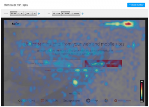
The cool stuff: If you haven’t heard about visual heatmaps, they’re all the rage in CRO conversations. Put simply, they allow you to identify hot and cold spots on your website – in other words, where visitors click and where they don’t. If your prize BUY NOW button is in the deep freeze, a heatmap lets you know a redesign is in order.
Visitor recordings can also be helpful as you launch a CRO strategy. Did you ever wish you could stand behind a visitor’s shoulder and watch as they navigate your site? Being able to see exactly where they got bored, confused, frustrated, or simply leaped up to answer the call of nature would be immensely valuable. That’s what you can do with visitor recordings. Play back the click journey(s) and you’ll soon be able to tell where the process falls apart.
Crazy Egg is definitely a major player in the CRO field. With a generous 30-day trial period and pricing that starts at $39 month, this service allows you a chance to practice before committing actual money.
The cool stuff: The big three offerings from Crazy Egg are heatmaps, visitor recordings, and A/B testing. We’ve already touched on heatmaps and visitor recordings, so let’s define A/B testing, which is a basic but critical part of CRO.
The overall process of CRO is to figure out what isn’t converting on your website and change it. The simplest way to do that is create nearly identical pages and split your traffic between them. Note we said NEARLY identical. By changing one thing at a time on a page, like say the color of the “buy” button, you can compare which version converts better.
By continuing to make one change at a time, you incrementally improve your conversion rate.
While heatmap tools are pretty standard fare with most CRO tools, EyeQuant has taken a different approach. Rather than relying on visitors’ actions to discern hot and cold spots on a web page, this company uses artificial intelligence (AI) to predict the areas that draw visual attention which, obviously, is a precursor (and perhaps more valuable measurement) to action.
The cool stuff: Where heatmaps collect and combine real world site interaction that plays out over time, EyeQuant’s Attention Map lets you upload a snapshot of a web page and delivers the verdict within a few minutes. This almost instant analysis comes to us courtesy of technical AI advances that make an educated guess as to where human eyes will go first.
One thing to keep in mind is that this service seems to work better with e-commerce websites. It tends to automatically decide that text heavy sites are too busy. While EyeQuant’s price might appear to be a state secret, we’ve managed to determine that entry-level packages start at around $100 per month.
As to whether your needs can justify the price – your call – but the case studies are pretty impressive.
The old war horse of CRO is something you’d have a hard time avoiding if you spend much time at all online but just because it’s been around a while doesn’t mean it’s past its prime. Not only has Google Analytics (GA) been revamped in recent years to make it even more valuable for CRO practitioners — it’s free. Included in GA are all the usual suspects of CRO like A/B testing, exit page, behavior flow, and more.
Final Thoughts
An often overlooked part of tuning your website for maximum conversions is how quickly it loads. Everything else being equal, a faster website means higher conversions. You’re doing yourself a serious disservice if you don’t pay attention to this. While we’re not trying to turn you into a programmer, there is a lot to accomplish through a few relatively simple strategies related to file compression.
Check out this Pingdom page to find out how quickly your website loads. Keep in mind that Google recommends two seconds or less and even uses this metric as part of its vaunted algorithm that determines where you place in search results. Improving site load speed is an ongoing parallel process to focus on at the same time as you learn to use the CRO tools we’ve discussed here. Good luck!
by Gary Stevens | Sep 21, 2018 | Industry News, User Experience
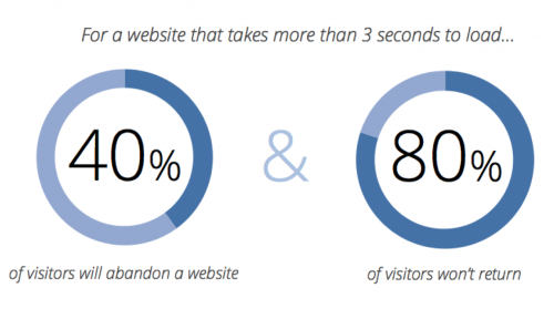
Internet users want a speedy experience and they’re not getting it, a fact that leaves them frustrated and website owners with less revenue. Don’t believe it? Numbers don’t lie. A full 53 percent of surfers want any site they visit load in three seconds or less. The largest ecommerce sites in the world recognize this necessity – they load incredibly fast. Most of the rest of the internet leaves a time gap that makes for a lot of gritted teeth and nervous toes tapping the floor. The good news is that speeding up a slow website is not difficult or time-consuming. The bad news is you might not choose to do it.
Are You Flirting with the Performance Poverty Line?
The performance poverty line is a term that represents the point at which being slow doesn’t matter because you’ve already lost most of your traffic. That number sits at around 8 seconds. The more pertinent question is, do you know your website’s speed. REALLY know your website’s speed?
No guessing because this is important stuff.
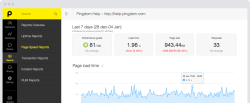
There’s an easy way to find out. Pay a visit to a website called Pingdom — it’ll probably load fast because it’s sort of their business — and enter your URL in the box. Select a location from the dropdown menu and hit “start.” Unless they’re exceptionally busy (it happens sometimes) you should get a performance summary in less than a minute.
There’s a good chance what you see won’t impress anyone, but that’s okay. Few websites do. We’re here to provide you with a road map to get those numbers headed down, down, down and your visitors to start getting happy, happy, happy. Let’s call this…
A 6-Part Roadmap to Fast Websites and Happy Customers
Part 1: Magically Shrink Your Website
Actually, as far as we know, there’s no way to magically shrink your website but you can get the same effect by applying a sweet little bit of technology called Gzip compression. When implemented, some site owners have seen overall file size reduction of as much as 70 percent. That’s huge. Actually it’s tiny and that’s the point. It works like this. When a request hits the server to view the website, it automatically zips all the files before sending them onto the requester’s browser, where it is unzipped and displayed.
Part 2: Fix Bad Design and Too Many HTTP Requests
Every element on your website — we’re talking about images, videos, scripts, and even text — generates an individual request to the server. The more “stuff” your website has, the more requests there are and the longer it takes to load. If ever there was an argument for using a minimalistic approach when designing your website, this is it. Fewer requests mean a faster website. The tricky part is to not get distracted by all things you could do and stick to only what is needed to accomplish the site’s mission.
Part 3: Put Hefty Images on a Diet
Images are huge. Incorrectly (or not at all) optimized, they put a terrible strain on bandwidth and leave the server and browser gasping from the strain. While we could write a book on the topic, there is one thing you can do that will fix a lot of the issues and that is choose the correct format — png, gif, and jpeg are good — and make the things as small as you can stand BEFORE uploading to your website. If you upload a full size image, even if you reduce it later, the server still has the original version and that’s the one that clogs the pipeline.
Part 4: Upgrade Your Hosting
We love cheap stuff as much as the next person but when it comes to choosing a web hosting plan, you need to understand the different types of plans and know when it’s time to upgrade. Inexpensive shared plans can be as low as a few dollars a month and that’s okay for a hobby or site that doesn’t have much traffic yet. Once you reach a certain level, though, the shared resource approach of this kind of plan will almost certainly mean slow-loading and downtime. While a dedicated server might not be worth the expense, a virtual private server or VPS hosting can be a great compromise.

Part 5: Turn on Browser Caching
Browser caching is an easy-to-implement, tactic that most fast-loading websites use. The idea is simple. Rather than force the server to send over all the website files every time someone visits, static files (those that don’t change) are stored in the browser’s temporary memory and only dynamic files have to be retrieved. Obviously, this doesn’t help on a first visit but, with browser caching enabled, subsequent visits will be quicker. For WordPress websites, W3 Total Cache is a free plugin to look for. Others just require a simple code addition.
Part 6: Resolve Plugin Conflicts
This WordPress-specific advice is based on the reality that a lot of site owners install plugins that they never update or even use. Considering the third-party nature of these bits of software, it should be no surprise that they don’t always play nice together — they weren’t intended to. If your WordPress website is slow or buggy, one of the first actions to take is to uninstall any plugins you aren’t using. After that, turn what’s left off one at a time and check site speed. There’s a good chance you’ll find one of the culprits to slow loading.
Final Thoughts
The state of technology today is such that people expect (even if it’s not a reasonable standard) a website to load in three seconds or less. A clean, fast-loading experience will go a long ways towards creating loyal customers and more revenue, which are both good things to shoot for as an online entrepreneur. Keep in mind that the process is iterative. There’s no magic wand that will turn your site into a speed burner. Small actions taken methodically, such as the ones described, should, over time, move you incrementally closer to that three second target. Good luck and thanks for reading.

Member author Gary Stevens is a front end developer. He’s a full time blockchain geek and a volunteer working for the Ethereum foundation as well as an active Github contributor.

by Harshala | Feb 23, 2018 | Mobile UX, Mobile Web, Responsive Design, User Experience
We thought it would be helpful to review the fundamentals of web design for aspiring web professionals in this article.
Responsive Web design is a Web design approach aimed at crafting sites to provide an optimal viewing experience. This is also aimed for easy reading and navigation with a minimum of resizing, panning, and scrolling across a wide range of devices.
What Is Mobile Responsive Design?
When a website is responsive, the layout and/or content responds or adapts based on the size of screen they are presented on. A responsive website automatically changes to fit the device you’re reading it on. Typically there have been four general screen sizes that responsive design has been aimed at: the widescreen desktop monitor, the smaller desktop or laptop, the tablet and the mobile phone.
Josh Byers 2012 article – A Beginner’s Guide to Mobile Responsive Design – StudioPress has examples given as the screen gets smaller, the content shifts and changes to the best display for each screen. This article also has more detailed information about
- Why Should I Care About Mobile Responsive Design? These days we need to think of mobile first.
- We first need to optimize the layout of the content.
- Next, we need to adapt the content that is shown (and only show content that is really needed).
- It has been amazingly easy to create a mobile responsive website for some time.
(more…)
by Harshala | Dec 22, 2017 | Industry News, State of the Web, Usability, User Experience, Web Professional Trends
Web professionals should be aware of this discussion concerning Web Typography & Layout: Past, Present, and Future. As a web professional, it is important to know what the future holds.
Key takeaways include:
- how to avoid being overwhelmed by all the tools and typefaces available today. We need to think of typography and layout as one.
- how to move away from frameworks and bring creativity back into layout. We should focus on larger type and readable layout, including proper use of whitespace.
- we should help the reader feel like a collaborator.
Three experts—Mozilla’s Jen Simmons, publication design legend Roger Black, and Jeffrey Zeldman (A List Apart)—discuss typography and layout on today’s web: where we are now, and where we’re going. CSS grid can be a very helpful tool. Jen Simmons provides a number of examples on her labs.jensimmons.com site.
Typography can encourage long-form reading and not just scanning.
What are the most exciting areas of cutting-edge experimentation in typographic technology and digital layout, and what new skills will we need to design tomorrow’s web content? At a minimum, we should understand CSS grid and variable fonts and how they can be properly applied. Layout and typography were connected in the age of metal type, and they will be again. We must make our pages readable and employ the time tested skills that were employed by typesetters so long ago. We should think in terms of properly sized type (which is responsive given that our content may be consumed on phones, tablets, desktops, or other devices).
This discussion also reviews the history of layout on the web, and what multi-device reading and orbital publishing means to the practice of publication design as we move away from frameworks. We need to bring creativity back into layout (including layouts that break the mold). We must fully understand the implications of CSS Grid and its portents and help the reader feel like a collaborator. There is a new wave of user customization, and we need to understand how it impacts our designs.
We encourage you to watch the discussion video and review the associated transcript.
For those aspiring web professionals who need a better understanding of these concepts, we recommend the following resources: