by Harshala | Feb 9, 2018 | CSS3, Industry News, State of the Web
In January we reviewed recent CSS updates. As a web professional you must be aware of constant changes taking place in our world. CSS Grid Layout is now supported by nearly 90% of modern browsers. It was adopted as a candidate recommendation by the W3C on December 17, 2017.
CSS Grid Layout
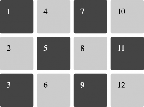
In this article I would like to focus on CSS Grid – a powerful layout system available in CSS. It is a 2-dimensional system, meaning it can handle both columns and rows, unlike flexbox which is largely a 1-dimensional system.

CSS Grid Layout
In the article A Complete Guide to Grid, Chris House provides many details about CSS Grid Layout along with examples.
Here are some key-points:
- In his introduction, Chris references two great resources – Rachel Andrew’s book (Get Ready for CSS Grid Layout) and Chris Coyier’s Complete Guide to Flexbox.
- He reviews the basics (including getting started with your container element display:grid, setting rows and columns and placing child elements).
- Of course, it is important to know the proper terminology (including grid container, grid item, grid line and more).
- He then provides a very useful overview of properties for the grid container and grid items.
Everything you need to learn CSS Grid Layout
In Rachel Andrews article Grid by Example explained basic concepts of Grid Layout which gives us a method of creating grid structures that are described in CSS and not in HTML. It helps us to create layouts that can be redefined using Media Queries and adapt to different contexts. Her 2016 book “Get Ready for CSS Grid Layout” has a meaningful quote by Eric Meyer in the forward. We think this nicely sums up the importance of CSS Grid Layout.
“Grid Layout is to Flexbox as PNG is to BMP, and then some.”
Resources
Here are additional resources about CSS Grid we believe are useful for Web Professionals.
- A collection of resources & tools to help you manage the Grid link
- Great examples which include an image of how the example should look in a supporting browser, they each link to a page with more information about the technique being shown, code and a CodePen of the example. Examples by Rachel Andrews
- This is an older example (but still useful) which tells how CSS grid are becoming popular these days. As web applications become more and more complex, we need a more natural way to do advanced layouts easily without hacky solutions that use floats and other less burdensome techniques. An exciting new solution for creating layouts comes with the CSS Grid Layout Module.
- CSS Grid Layout excels at dividing a page into major regions, or defining the relationship in terms of size, position, and layer, between parts of a control built from HTML primitives. MDN Web Docs also have great examples of CSS Grid.
We hope you find these overviews and examples in CSS Grid world useful. As always, we look forward to your comments and feedback (whether you are a member or not). What have been your experiences with employing CSS Grid in real world applications for clients. How was the work received? Did any issues arise?
For those who would like to have a little fun, try out CSS Grid Garden.
If you aspire to be a web professional and don’t know where to start, we offer a number of beginning classes to our members via our School Of Web learning management system. These include the fundamentals of CSS and HTML (and much more). As a member, your first class is free.

by Harshala | Feb 2, 2018 | Industry News
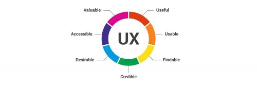
User experience design (UX, UXD, UED or XD) is the process of enhancing user satisfaction with a product by improving the usability, accessibility, and pleasure provided in the interaction with the product. User experience design encompasses traditional human–computer interaction (HCI) design, and extends it by addressing all aspects of a product or service as perceived by users. As an aspiring or practicing web professional, we should make every effort to enhance user satisfaction.
UX Term origin
User Experience Architect Donald Norman – it has been said that he has invented this term as he thought human interface and usability were too narrow and he wanted to cover all aspects of the person’s experience with the system including industrial design graphics, the interface, the physical interaction and the manual. Since then the term has spread widely, so much so that it is starting to lose its meaning. He has written his personal reflection about this in his Wikipedia article.

(more…)

by Harshala | Jan 19, 2018 | CSS3, HTML5
What’s been happening with HTML and CSS?
Just like having the ability to speak a foreign language, this sort of skill is helpful in almost all professions. HTML and CSS are the foundational languages of the web. As web professionals we should know what updates are taking place in HTML and CSS world. I came across few articles about what’s new about both CSS grid and HTML.

CSS Grid Layout excels at dividing a page into major regions, or defining the relationship in terms of size, position, and layer, between parts of a control built from HTML primitives. (more…)
by Harshala | Dec 22, 2017 | Industry News, State of the Web, Usability, User Experience, Web Professional Trends
Web professionals should be aware of this discussion concerning Web Typography & Layout: Past, Present, and Future. As a web professional, it is important to know what the future holds.
Key takeaways include:
- how to avoid being overwhelmed by all the tools and typefaces available today. We need to think of typography and layout as one.
- how to move away from frameworks and bring creativity back into layout. We should focus on larger type and readable layout, including proper use of whitespace.
- we should help the reader feel like a collaborator.
Three experts—Mozilla’s Jen Simmons, publication design legend Roger Black, and Jeffrey Zeldman (A List Apart)—discuss typography and layout on today’s web: where we are now, and where we’re going. CSS grid can be a very helpful tool. Jen Simmons provides a number of examples on her labs.jensimmons.com site.
Typography can encourage long-form reading and not just scanning.
What are the most exciting areas of cutting-edge experimentation in typographic technology and digital layout, and what new skills will we need to design tomorrow’s web content? At a minimum, we should understand CSS grid and variable fonts and how they can be properly applied. Layout and typography were connected in the age of metal type, and they will be again. We must make our pages readable and employ the time tested skills that were employed by typesetters so long ago. We should think in terms of properly sized type (which is responsive given that our content may be consumed on phones, tablets, desktops, or other devices).
This discussion also reviews the history of layout on the web, and what multi-device reading and orbital publishing means to the practice of publication design as we move away from frameworks. We need to bring creativity back into layout (including layouts that break the mold). We must fully understand the implications of CSS Grid and its portents and help the reader feel like a collaborator. There is a new wave of user customization, and we need to understand how it impacts our designs.
We encourage you to watch the discussion video and review the associated transcript.
For those aspiring web professionals who need a better understanding of these concepts, we recommend the following resources:
