by Harshala | May 18, 2018 | Industry News, Web Content
The Web continues to evolve. Recent projections indicate that virtual reality and augmented reality may soon become a major part of web interfaces. We thought it might be helpful to provide a quick overview of these technologies and provide additional resources about the potential impact on the web. As an aspiring or practicing professional, you should be aware of these technologies.
What is Virtual Reality?
Virtual Reality is the computer-generated simulation of a three-dimensional image or environment that can be interacted with in a seemingly real or physical way by a person using special electronic equipment, such as a helmet with a screen inside or gloves fitted with sensors.
Current VR technology most commonly uses virtual reality headsets or multi-projected environments, sometimes in combination with physical environments or props, to generate realistic images, sounds and other sensations that simulate a user’s physical presence in a virtual or imaginary environment. This Wikipedia article has detailed information about the technology and its applications.
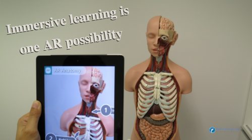
What is Augmented Reality?
Augmented reality (AR) is a direct or indirect live view of a physical, real-world environment whose elements are “augmented” by computer-generated perceptual information, ideally across multiple sensory modalities, including visual, auditory, haptic, somatosensory, and olfactory. The overlaid sensory information can be constructive or destructive and is spatially registered with the physical world such that it is perceived as an immersive aspect of the real environment. In this way, augmented reality alters one’s current perception of a real world environment, whereas virtual reality replaces the real world environment with a simulated one. Augmented Reality is related to two largely synonymous terms: mixed reality and computer-mediated reality. You can find more information about this at this Wikipedia article.
(more…)

by Harshala | Mar 23, 2018 | Industry News
Consumers expect to use products and services from anywhere – and often on the go. Connected devices are no longer only phones, laptops, wearables’, smart coffee machines, or even talking fridges. We’re stepping further with smart houses, connected city infrastructure, intelligent assistants, and highly automated vehicles.
Consumer Electronic Show (CES) of 2018 have brought consumers the greatest hype around automation, connectivity, and augmented reality we could only dare to perceive.
New technology trends in 2018
- Autonomous technology is turning delivery services upside down
- Drones are playing the piano and could be doing much more
- Augmented reality builds trust between drivers and driverless cars
- Intelligent home assistants. Alexa, Siri and Google – a war that hasn’t even begun
- Voices, voices everywhere. Infrastructure and cars are really talking
The automotive industry is gaining a new role as a hub that helps businesses in various fields transform their products and services into on-the-go solutions and adapt to the future mobile-first and autonomous-first world. We can read this article to know more about latest trends in technology.
(more…)
by Harshala | Mar 9, 2018 | Industry News, Search, Web Marketing
What Is SEO / Search Engine Optimization?
We thought a review of the fundamentals of search engine optimization for aspiring web professionals would be helpful this week.
SEO stands for search engine optimization. It is the process of getting traffic from the free, organic, editorial or natural search results on search engines.
All major search engines such as Google, Bing and Yahoo have primary search results, where web pages and other content such as videos or local listings are shown and ranked based on what the search engine considers most relevant to users. Payment isn’t involved, as it is with paid search ads.
This article has a short video which explains SEO. It also contents links to different SEO Guides and Books and other resources.
What Is SEM?
SEM (Search Engine Marketing) is the process of gaining website traffic by purchasing ads on search engines.
(more…)
by Harshala | Feb 9, 2018 | CSS3, Industry News, State of the Web
In January we reviewed recent CSS updates. As a web professional you must be aware of constant changes taking place in our world. CSS Grid Layout is now supported by nearly 90% of modern browsers. It was adopted as a candidate recommendation by the W3C on December 17, 2017.
CSS Grid Layout
In this article I would like to focus on CSS Grid – a powerful layout system available in CSS. It is a 2-dimensional system, meaning it can handle both columns and rows, unlike flexbox which is largely a 1-dimensional system.
CSS Grid Layout
In the article A Complete Guide to Grid, Chris House provides many details about CSS Grid Layout along with examples.
Here are some key-points:
- In his introduction, Chris references two great resources – Rachel Andrew’s book (Get Ready for CSS Grid Layout) and Chris Coyier’s Complete Guide to Flexbox.
- He reviews the basics (including getting started with your container element display:grid, setting rows and columns and placing child elements).
- Of course, it is important to know the proper terminology (including grid container, grid item, grid line and more).
- He then provides a very useful overview of properties for the grid container and grid items.
Everything you need to learn CSS Grid Layout
In Rachel Andrews article Grid by Example explained basic concepts of Grid Layout which gives us a method of creating grid structures that are described in CSS and not in HTML. It helps us to create layouts that can be redefined using Media Queries and adapt to different contexts. Her 2016 book “Get Ready for CSS Grid Layout” has a meaningful quote by Eric Meyer in the forward. We think this nicely sums up the importance of CSS Grid Layout.
“Grid Layout is to Flexbox as PNG is to BMP, and then some.”
Resources
Here are additional resources about CSS Grid we believe are useful for Web Professionals.
- A collection of resources & tools to help you manage the Grid link
- Great examples which include an image of how the example should look in a supporting browser, they each link to a page with more information about the technique being shown, code and a CodePen of the example. Examples by Rachel Andrews
- This is an older example (but still useful) which tells how CSS grid are becoming popular these days. As web applications become more and more complex, we need a more natural way to do advanced layouts easily without hacky solutions that use floats and other less burdensome techniques. An exciting new solution for creating layouts comes with the CSS Grid Layout Module.
- CSS Grid Layout excels at dividing a page into major regions, or defining the relationship in terms of size, position, and layer, between parts of a control built from HTML primitives. MDN Web Docs also have great examples of CSS Grid.
We hope you find these overviews and examples in CSS Grid world useful. As always, we look forward to your comments and feedback (whether you are a member or not). What have been your experiences with employing CSS Grid in real world applications for clients. How was the work received? Did any issues arise?
For those who would like to have a little fun, try out CSS Grid Garden.
If you aspire to be a web professional and don’t know where to start, we offer a number of beginning classes to our members via our School Of Web learning management system. These include the fundamentals of CSS and HTML (and much more). As a member, your first class is free.
by Harshala | Feb 2, 2018 | Industry News
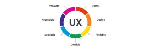
User experience design (UX, UXD, UED or XD) is the process of enhancing user satisfaction with a product by improving the usability, accessibility, and pleasure provided in the interaction with the product. User experience design encompasses traditional human–computer interaction (HCI) design, and extends it by addressing all aspects of a product or service as perceived by users. As an aspiring or practicing web professional, we should make every effort to enhance user satisfaction.
UX Term origin
User Experience Architect Donald Norman – it has been said that he has invented this term as he thought human interface and usability were too narrow and he wanted to cover all aspects of the person’s experience with the system including industrial design graphics, the interface, the physical interaction and the manual. Since then the term has spread widely, so much so that it is starting to lose its meaning. He has written his personal reflection about this in his Wikipedia article.
(more…)

by Mark | Jan 26, 2018 | Content Management Systems, Industry News
As a web professional, you are likely aware that WordPress is used as the principle technology for over 25% of the top 10 million websites (actually now 29% based on the December WordCamp US State of the Word 2017). To better understand the reach of this technology – in the above mentioned State of the Word presentation, it was mentioned there are now over 47,000 plugins and said plugins have been downloaded over 633 million times.
Version 5 coming (Project Gutenberg)
We have recently learned that the next major update (version 5.0) will be based on Project Gutenberg. We understand this will be the most extensive update since version 2.0 of WordPress. As a web professional, it is important you understand the implications of this upgrade (and the potential effects with your clients). These include:
- the default editor is changing from the current TinyMCE editor (and changing significantly). If your clients are editing their own content, you need to either train them on the new editor or make certain you use the classic editor plugin (you might want to try both out to better understand the changes). Note this is beta software at the time of this writing so you do not want to install this on any production WordPress sites.
- although you can presently test Project Gutenberg, it is presently available as a plugin (meaning you may not be able to fully test your current themes and plugins at the moment).
- the new focus will be on conceptual editing (similar to what you may have experienced with LinkedIn Pulse or similar approaches).
- the focus is on “identifying and adding meaning to content using blocks and block contests.” See below for what this means.
(more…)