by Mark | Sep 13, 2023 | Web Accessibility, Web Pro News
Today we are taking a moment to remember Molly Holzschlag, an early pioneer of the web, who died in early September at age 60. Molly was a board member and instrumental in helping the World Organization of Webmasters (now Web Professionals Global) grow over the past decades, and she was a recipient of our Web Professional of the Year award in recognition for her passion for the web and forward thinking.
Our Executive Director, Mark DuBois, first met Molly in 2005 at a talk she gave at Joliet Junior College in Joliet, IL. Nicknamed “the fairy godmother of the web,” Molly was passionate about promoting web standards and accessibility long before others took up the cause. She traveled around the world to web conferences, always seeking opportunities to discuss the web and teach the next generation of web designers and developers.
She was a prolific author, writing over 30 books about the web. Her career included serving as Project Leader from 2004-2006 for the Web Standards Project (WaSP), a coalition that pushed browser makers such as Netscape and Opera to support modern web standards. Molly was an “invited expert” on the CSS Working Group of the World Wide Web Consortium, which is the body that determines the standards that run the web. Additionally, she served on the W3C HTML and GEO working groups and performed consulting services for multiple companies including Microsoft.
Molly never stopped fighting for her vision of a more egalitarian web and was once quoted as saying, “Anybody who creates a software product for the Web that is not usable and accessible by as many browsers as possible, by as many people as possible—we have failed the greater idea of the Internet.” Along with Dave Shea, she launched CSS Zen Garden in May 2003, which was “built to demonstrate what can be accomplished visually through CSS-based design.”
At Web Professionals Global, we will continue working toward web standards and accessibility, the causes that were so close to Molly during her life. Molly will be missed by our entire community of web professionals, and we offer our sincere condolences to all of her family and loved ones.

by Mark | Aug 21, 2023 | AI and Machine Learning, Education
One of the hottest topics in technology currently is artificial intelligence (AI), which is seemingly poised to affect many aspects of our lives. One of these areas is education, as schools, teachers, parents and students grapple with how to best deploy and manage AI tools in the classroom. At Web Professional Global we have many secondary and post-secondary students in our ranks, so we keep a close eye on developments that affect our members. In this article we will take a look at some of the challenges associated with education and AI and solutions for moving forward.
Overview
The rise of tools like ChatGPT has far-reaching implications, and in many cases it provides students with a quick and convenient way to complete classwork. These AI tools can write and edit essays, summarize articles, and complete other homework assignments. This allows students to “pass” subjects without actually understanding the underlying materials. This leads to students feeling like they can go through life without actually putting in hard work and learning valuable skills.
However, teachers can also use AI tools to their advantage. AI can help provide answers to students who have questions about material and provide feedback on assignments. Schools that have leveraged AI have also found that students are often more inquisitive when it comes to asking AI questions as it eliminates the fear of “asking a dumb question” in front of peers. As we move forward, it will be important to utilize AI so that it helps teachers in the classroom. AI will never replace teachers, nor should it. Students will always need a caring adult to lead in the classroom. We never want to place an AI system between the student and teacher, as we have already seen how generations have been affected by technology.
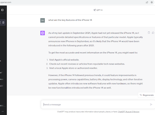
Keep in mind that many AI application programming interfaces (APIs) take a fair amount of creative license when answering questions. While it may seem like an AI tool is speaking factually and with authority, it might be spinning the answer a bit to reflect, for example, the beliefs of the person who programmed it. Also, remember that many AI tools are limited in what information base they are working from. For example, at the time this article was written the ChatGPT’s data set covers only information prior to September 2021. This means if you asked it to tell you the features of the iPhone 14 it would tell you that it doesn’t exist:

Our Response
We need to recognize AI as a tool first and make it a tool. AI should be a help and not a replacement. As humans, we are purpose driven. We are happiest when we have a purpose and are striving toward a goal. Some may fall into the trap of just letting AI do everything for them, and in doing so they will be relinquishing their own humanity. The rest of us will see AI as a tool, like the smartphone. You can use it to help you navigate your busy life, or, as many do, you can become overly dependent on it. Our fervent hope is that once again humankind rises above AI technology, recognizes it for what it is and does not allow it to seduce us to become its subject.
We believe these challenges provide an opportunity for those in the education space, especially students, to commit (or re-commit) to ethical behavior in the classroom and when working on academic projects. Web Professionals Global is part of the content authenticity initiative with Adobe and we also have a Code of Ethics that non-members can sign. Secondary and post-secondary students who complete coursework and receive our certifications all must adhere to the Code of Ethics, which includes the following:
Being open and truthful: Although we cannot guarantee that all of the members of the Web Professionals Global community subscribe to this code of ethics, as a professional association we aspire to instill in our members and non-members alike the highest ethical standards.
Respecting and protecting intellectual property: As web professionals, it’s our responsibility to protect the intellectual property rights of others including personal data and all electronic media and files. As web professionals, we have a duty and a fiduciary responsibility to protect this integrity by adopting and implementing best practices of our customer’s data and to keep it secure.
Being responsive: As web professionals we owe it to our clients and stakeholders to respond to inquiries in a timely manner. Web Professionals Global members should be candid about their available response time and communicate that to customers in advance.
Utilizing written communications: As web professionals it is our responsibility to effectively communicate with our clients and stakeholders. When making a request of the customer, or when making promises, put them in writing. Despite our best efforts, disputes sometimes happen. Having a well-documented and agreed-upon relationship will serve both parties. This should include all conversations about who does what and when, work to be performed, timelines, cost and change orders.
Find Out More
Interested in hearing more about the ethics of AI and our work at Web Professionals Global? Contact us today.

by Mark | Jul 14, 2023 | Web Competitions
You may have read our recent article on our participation in the SkillsUSA National Web Design and Development competition in Atlanta, GA that took place in June. Today we are highlighting how we helped Texas run their state SkillsUSA competition and how that experience helped prepare their students for the national competition. In fact, two Texas students, Jean-Paul Metoyer and Carl Omondi of Carl Wunsche Senior High School in Spring, TX (pictured above with Mark DuBois and Jonathan Worent of Web Professionals Global) won the gold medal for the high school competition. Web Professionals Global is proud to welcome Jean-Paul and Carl into our membership ranks.
First, let’s take a look at how Web Professionals Global helped Texas and other states with their competitions. Competitions can be run in person or entirely online, making it easy for more students to join and participate in each state. Not only does the new approach make it easier for any state to run their own web design and development competition, but it also ensures that every state is conducting their own competition to prepare students for the national competition. This model gives all states the same turnkey resources to ensure a successful competition that engages students.
This is the second year for Web Professionals Global supplying turn-key competitions to the state SkillsUSA event teams. Each year we double the number of states who take advantage of our competition package. We are also seeing the results. For states that used our materials in 2022 and again this year, we saw improvements in competitors building their skills to help them better compete at the national competition.
Our competition support includes:
- Online web design exam similar to what the competitors might see at nationals
- Competition project with client assets and judging rubrics
- Handouts for competitors with overview and links to resources
- Online development environment “IDE” for each competitive team
- State event team and judge support
Hear from a member of the Texas SkillsUSA team on how we helped:
Mark, your platform and contest is very well-designed and easy to use. The students truly loved competing in this contest! I can’t wait to see what you all have for nationals as well. It’s going to be wonderful! We thoroughly enjoyed the integration into this year’s contest and look forward to working with you again on next year’s contest!” – Renee Blackshear, Instructor, Statewide Faculty Senate, SkillsUSA Texas

Jean-Paul and Carl chatting with working web professionals at the SkillUSA national competition
Hear From the Winners
We caught up with Jean-Paul and Carl to hear about their experience in the state and national competitions.
How do you feel the state competition prepared you for the national competition?
Jean-Paul: I did not compete at the state level, I subbed in for Carl’s original partner, our friend Aaron, who was going to college. However, both Carl and Aaron explained to me the difficulties of the competition, which prepared me for the level of difficulty at the national level.
Carl: Personally, getting experience at the state level was exhilarating. From the start, Aaron and I had a strategy of separating technical and creative tasks which meant we could each shine in our own way. As the person in charge of design and creative aspects of the competition, I was able to guide the direction that the web project that we would eventually turn in would take and use my creativity to solve the problems I presented. Therefore, at least towards preparation for the national event, the Texas state championships were very similar to the national competition. The only difference was that during states, it was only the technical aspect that was judged by our ability to develop a website since we had no prompt to go over and design a website around.
How did you enjoy participating in the state and national competitions?
Jean-Paul: As previously stated, I did not compete at the state level. In contrast, competing at the national level was very fun. Being able to explore Atlanta was exciting, but the competition itself was truly where all the joy was. During the orientation, other teams were asking extremely technical questions, showing me and Carl that these teams were prepared and well-knowledged. This fueled my competitive spirit, thriving me to do great in tandem with Carl in order to win. The prompt surrounding a nature-based nonprofit website was very fun to design and develop, even with the restrictions. Overall I had lots of fun competing, experiencing Atlanta, and socializing with other competitors.
Carl: I absolutely loved competing at the national level in SkillsUSA. As I found out, apparently the Texas delegation was infamous for doing things its own way and is generally independent of the other states in terms of planning and hotel booking; meaning that I did not get to meet that many people from other states during my stay at the hotel. With that being said, however, meeting a range of different people all the way from Alaska and Hawai’i to Oregon and Maine was an intriguing experience coming from the hot fields of Texas. I loved the pin exchange experience and the rush of awe and interest anytime I would ask people what state they are from.
What was it like hearing from the panel of three web professionals (Angel, Jessica and Shan) who are succeeding in the world of web design and development?
Jean-Paul: Hearing from the three speakers was very enlightening and informative, as I could relate to some of their experiences with starting coding at an early age. It also gave me a tangible insight on the world of web development after high school and college. Being able to hear from these speakers both reaffirmed my goals within software development and made me feel like I was on the right track.
Carl: The concentration of deep and valuable technical and career knowledge I got during that talk cannot be adequately explained. A salient point I noted from that talk is that it changed my perception about career advancement and how I can approach breaking into web development. I had always thought that it was better to do a range of things since it would make me more valuable as a web developer. However, the panel of judges completely went against that philosophy by basically saying that being an expert is going to help me get further and be more valued. This is just one of the lessons that I got during that talk and it is immensely going to impact the path that I take moving forward towards my career. And for that, I thank the panel and Web Professionals Global for serendipitously exposing me to such knowledge early on in my career.
What is it about web design that you love so much?
Jean-Paul: My favorite part of web design is that it mixes logic with art, which are two things I love dealing with. Staring at my screen for hours trying to figure out how to center a div or implementing an animation brings a lot of joy to me because at the basic level, it’s like solving a math problem, but with art involved.
Carl: The most intriguing aspect about web design and development is the brainstorming process. Whether it is thinking about the most effective way to communicate a brand or what technical techniques I can employ to bring a certain design to life, the euphoric lift I get every time I creatively solve a problem is what keeps me going in this industry and pushes me to learn more.
How does it feel knowing you are now members of Web Professionals Global, an international professional association?
Jean-Paul: Joining Web Professionals Global, an international professional association, is a humbling experience. It’s a reminder of the vast, interconnected world of web professionals that I am now a part of. This opportunity is not just a recognition of my efforts in web development, but also a responsibility to learn, contribute, and grow within this global community. I am grateful for this chance to deepen my understanding and look forward to the journey ahead.
Carl: I see this as definitive proof that I am indeed not as inadequate, technically speaking, as my imposter syndrome sometimes paints me to be.
What was your favorite part of the competition?
Jean-Paul: My favorite part of the competition was during the coding section. Being able to mix the technical side of coding with the artistic part of web design is always enjoyable to me, which is what the heart of this competition is.
Carl: My favorite part of the competition was the design part as we were given the prompt for the non-profit. The adrenaline flowing through my body as I was writing together every piece of information I could about the company in order to translate it into a design that satisfies the prompt was engaging and my favorite part of the process.
What went through your mind when you saw Texas on the big screen?
Jean-Paul: As soon as we saw Texas as the finalist, Carl and I jumped up grabbing each other, screaming in elation. To see all the months of fundraising, trying to get a bigger budget, and practicing all coming together was truly an amazing moment.
Carl: In that moment, it was absolute euphoria.
How did it make you feel when you were on stage in front of over 16,000 people and Mark, the Executive Director, was hanging the gold medals on you two?
Jean-Paul: It was one of the best feelings that I ever experienced. For all our hard work to pay off was calming yet exhilarating. And to have Mark, one of the best developers I have ever met, to give us the award was truly an honor.
What did you say to each other afterward?
Jean-Paul: We were so happy to have the award ceremony end, because we were extremely nervous throughout the almost two hours of waiting for our competition to be called. This left us with our thoughts about if we could actually win, which was very nerve-racking. Overall, we were elated that everything was over and that we did not have to worry anymore.
Carl: Technically, the very first words out of my mouth when we found out we were finalists were “No way” over and over again as the Texas state delegation cheered us on. Afterwards, Jean and I, from the moment we left the stage to the hotel and plane, kept talking about how our efforts to both fundraise and coach ourselves to nationals paid off. Coming from a Title I high school, fundraising for nationals was a communal effort for us involving everyone from the librarian to the custodians and district administration. Therefore, the knowledge that we could now bring back something to show all those who had helped us in a myriad of different ways that their efforts were worth something was the immediate reward prior to finding out that we were indeed number one in the United States for web development.
Who did you call first?
Jean-Paul: The first people we talked to were our friends in a group chat who we had competed with at the state level in other competitions, and who helped fundraise throughout the entire process.
Carl: Unfortunately, my phone died as we were backstage about to receive our medals. However, leading up to the release of the final spots, I had texted my friends in a group chat who were all watching live from different parts of the country and world.
What would you tell students who are thinking of participating in next year’s state and national Web Design and Development competitions?
Jean-Paul: To definitely prepare. The competitors at the national level are very knowledgeable about every aspect of the competition, so you need to prepare for everything.
Carl: The most practical advice I can give for next year’s competitors is, as cliché as it is, to practice. Indeed, most of the knowledge that I applied towards winning nationals came from making my own web projects and that is what helped land me this distinction as a national champion. With technology, and by proxy the web, becoming ever more ubiquitous in our lives, it is only going to get more competitive moving forward; thus practicing by making more projects is the best way to learn since that is the technical skill that is going to be judged the most especially at the national level.

Jean-Paul and Carl on stage with the silver and bronze medal winners as well as Web Professionals Global team members
Congrats again to Jean-Paul, Carl and all the other competitors for a job well done. If you are a student, teacher or parent interested in hearing more about how you can get involved in next year’s state and national competitions, contact us today at 662-493-2776 or membership@webprofessionalsglobal.org.

by Mark | Jun 29, 2023 | Web Competitions
Web Professionals Global was proud to once again participate in the 2023 SkillsUSA National Leadership & Skills Conference in Atlanta, GA at the Georgia World Congress Center from June 19-23. Web Professionals Global ran the Web Design and Development competition for the 20th year in a row, providing students from a number of states with the opportunity to participate. This comes on the heels of our organization helping to facilitate some state competitions, the winners of which were invited to the national competition. Check out this previous article on how we helped run the state competitions.
As Executive Director, I (Mark) would like to thank Dave, Bryce, Jonathan and Steve for traveling to Atlanta and helping to put on yet another successful competition. This team has been helping with this competition for years, and we are so grateful. We could not have done it without you.

Competition Overview
For those not familiar with how the SkillsUSA National Web Design and Development competition, the competition guidelines were as follows: Teams of two completed a series of challenges focusing on creating a website for a client and a specific target audience. Judging focused on meeting the client’s needs, usability and accessibility, and industry-standard best practices. Teams were evaluated on the process they used to meet the challenges and how well they worked as a team. Teams used the internet to access all competition materials (including the coding environment).
The Web Professionals Global Organization SkillsUSA team provided the students with not only a competitive environment to test their technical skills but also real-world training from real-world professionals and networking opportunities.

The competition was divided into the following days:
Tuesday, June 20:
This was training day when the secondary and post-secondary teams gained some real world training from Jonathan, the Director of Competitive Events for Web Professionals Global, and me (Mark). We talked about the competition, industry trends, and the web design process from concept to launch.
The competitors were then treated to a lively interactive panel discussion with three local web professionals representing web coding and project management (Angel McCurdy), branding and graphics (Jessica Murphy) and web marketing and entrepreneurship (Shan Thomas). The competitors learned the importance of audience engagement, perseverance, execution and much more.
Wednesday, June 21:
This was the day of the secondary competition for high school students.
Thursday, June 22:
This was the day of the post-secondary competition for college students. We also held a competition debrief at the end of the day.
Friday, June 23:
This was the awards ceremony at State Farm Arena, where 16,880 SkillsUSA competitors, advisors and event runners all showed up for the big reveal of the winners in over 100 different events.

Competition Winners
High School
Gold: Carl Omondi/Jean-Paul Metoyer, Carl Wunsche Senior High School, Spring, TX
Silver: Daniel Cardone/Natalia Vazquez, Blackstone Valley RVTHS, Upton, MA
Bronze: Rhys Jordan/Steven Shoen, Meridian Technical Charter High School, Meridian, ID
College
Gold: Allen Gustrowsky/Brandon Gustrowsky, Southern Adventist University, Collegedale, TN
Silver: Eric Nims/Elizabeth Sheba, Gwinnett Technical College, Lawrenceville, GA
Bronze: Kenli Shaw/Michael Vars, Northwest Kansas Technical College, Goodland, KS

Congratulations to all the winners and participants in the competition. We had an outstanding group of students who all have very bright futures in the industry. In the coming days we will be publishing more articles about the competition, so stay tuned.
Reach out to us today for information on our certification programs and the work we are doing to further the community of web professionals.
Check out more photos from the competition here

by Mark | Jun 15, 2023 | Employment Issues, Web Design, Web Development
In tough economic times, some industries rise while others fall. Industries that make money or help others make money seem to always fare better than others. We have heard how the tech industry has been laying off large numbers of employees and contractors. You can argue much of this is COVID-19 fallout, with companies still fearing a potential recession.
The headcount at Twitter has been reduced by 70% in the past year. Facebook laid off about 13% of employees in 2022, and will probably lay off another 12% in 2023. Other tech companies that have recently reduced workforce numbers include LinkedIn, Amazon, Apple, Netflix, Microsoft, Yahoo, Zoom, Salesforce and more.
However, these figures are just one side of the equation. Looking at the U.S. Bureau of Labor statistics for May, we can see that U.S. tech occupations across the economy increased, and the unemployment rate decreased slightly from 2.1% to 2.0%. The current national average unemployment rate across all occupations is 3.7%. This means that even with big cuts in the large tech companies, we are seeing great resilience in the tech job market as a whole. Specifically, web design and development jobs are as strong as ever.
What Do the Numbers Say?
With all the economic turmoil in the tech sector, is entering a career in web design and development a good idea? Let’s look at the numbers. Overall, employment of web developers and digital designers is projected to grow 23 percent from 2021 to 2031, which is a much faster rate than the average for all occupations. It is estimated that there will be 21,800 openings for web developers and digital designers annually over the next decade. A large portion of these openings will be to replace retiring designers and developers.
So, why is web design and other tech careers growing even in the times of layoffs? Web design and development is key to how companies make money. Every company needs to get its product story to market, which is where the web designers and developers come in. Web design is key to how a company makes money.
Think about it: who are the creative people managing the search engine optimization (SEO) that drives connections with the customers? Who creates the engaging content, graphics and sites that deliver the product story that gets people to buy? The answer is web developers and designers who help to execute marketing in a way that makes a company successful.
What Can I Do With Web Design and Development Skills?
Although many people think of the tech world when it comes to web designers and developers, they are in high demand in virtually all industries including healthcare, energy, manufacturing, telecommunications, financial services, and retail. Put simply, any company or organization that needs to reach a target audience and maintain an online presence must have designers and developers. Those with web design and development skills can work in many different areas including programming, cybersecurity, database management, AI and robotics, graphic design, information security, user experience (UX) and others.
The good news is that a career in web design and development does not require a traditional four-year degree. You can earn certifications, like the ones we offer here at Web Professionals Global, that will demonstrate your skills and set you apart when it comes to proving yourself in the professional working world. If you have a certification (or multiple certifications) and a portfolio of projects you have created, hiring managers will be eager to talk with you because they know you would be starting with them ready to hit the ground running on day one. Plus, many designers and developers work on their own with a variety of different clients and act as their own bosses.
Why is it Important to Be Part of a Community of Professionals?
If you are considering becoming a web design or development professional, take advantage of becoming part of the largest community of web professionals in Web Professionals Global. Our mission is “Community, Education and Certifications,” and we help promote the advancement of all professionals in internet-based careers. We have special programming and certifications for web educators and teachers, and we work with teachers who want help or direction from a local or regional professional as well as independent and remote designers and developers who need advice running their own business. Web Professionals Global really is the one-stop shop for those in internet-based careers at any level.
Start Your Career Today
Whether you are a teacher looking for web design and development certifications for your students, or you are an adult seeking to transition into a new career, we can help. Reach out to us today to learn how Web Professionals Global can assist you in advancing your career.

by Mark | May 31, 2023 | AI and Machine Learning, CSS3, JavaScript, Web Accessibility
Hard to believe we are almost at the middle of 2023. Time flies. As we prepare for our 20th national web design and development competition in Atlanta (beginning June 20), we thought it might be useful to share some of the articles we have been reading.
AI and images
Before we cover those articles, we feel it is important to mention our featured image. This was generated using Adobe FireFly. We used the following text to have the image generated. Note that we were rather specific in what we asked for (and the technology complied).
Looking at a desktop holding a phone, tablet and laptop along with a notebook with a pen. The desktop has one succulent plant. Sunlight is coming through a window to the left of the desktop.
If you expand the image, you will note that there is a tag assigned in the lower left corner indicating this image was generated using AI. We never cease to be amazed at how quickly one can create images (and how detailed they are).
We recently became members of the Content Authenticity Initiative. As we have mentioned in earlier weblog posts, the purpose is “to provide media transparency to allow for better evaluation of content.” We encourage readers to check out this initiative (and consider becoming members). In our view, as AI generated images become more prevalent, it is important to inform everyone that the image has been computer generated. We view this in a vein similar to copyrights. If one uses something that has not been created by the author, it is important to inform (and respect) where the images come from. That is why we commit to not only providing the source, but the text used to generate these images.
Accessibility
For those who missed it, May 19 marked Global Accessibility Awareness Day. The GAAD Foundation was launched in 2021 to mark the 10th anniversary. The focus is to make accessibility a core requirement. We encourage you to review the site (and focus on accessibility every day, not just May 19th).
CSS
We recently encountered a nice review of what’s new in CSS and UI. The article outlines 20 recent developments.These include responsive design improvements (such as container queries and style queries). The :has( ) selector lets one check if a parent element has specific children. There are many other enhancements which professionals can take advantage of (either now or very soon). We encourage readers to review the article to learn more about changes happening this year.
Also, we recently learned that scoped CSS is back. “Scoped styles allow you to contain a set of styles within a single component on the page.” We encourage readers to review the capabilities discussed in this article. Some nice examples are also provided.
We also came across this article (written in January) discussing new CSS relative units. Did you know there are roughly 50 CSS length units?
JavaScript
We recently encountered this nice overview of new JavaScript features coming in ECMAScript 2023. Many of these changes may have significant uses in your code. For example, change array by copy and array find from last. In addition to these smaller proposals, there are 4 larger ones. These include iterator helpers, temporal, decorators, and making resource management obvious.
National Web Competition
This year marks our 20th year of providing a national web design and development competition with SkillsUSA (yes, we started as a demonstration competition in 2004) and we have been running this ever since (even during the pandemic). We could not do this without the help of many people. We really appreciate their help and are posting additional articles. We managed to provide assistance to a number of states this year. We hope to see the winners of those state competitions at our national competition in June.
Feedback please!
That is what we found interesting this month. As always, we are keen to learn what you found interesting (and what you would like to learn more about). Please let us know in the comments.

by Mark | May 24, 2023 | AI and Machine Learning, Content Strategy
As readers know, we live in the age of significant disinformation. From political campaigns in various nations to recent untrue reports of an explosion at the Pentagon, such misinformation is meant to sow distrust, confusion, and other malicious intents. Given the rise of artificial intelligence (large language models) and the ease of creating images, video, audio and more, we at Web Professionals Global have joined the Content Authenticity Initiative. [Like all links, this will open in a new browser tab.] You might have to scroll a bit as there are now over 1,000 members of this initiative (organizations and citizens).
What is CAI?
Essentially, CAI (Content Authenticity Initiative) is a community of tech companies, non-governmental organizations (like Web Professionals Global), academics and others working to “promote adoption of an open industry standard for content authenticity and provenance.” What is the source of the image, video, audio in question? How was it created? If something has been tampered with, this is tracked and evident when examining the meta data. If you are not a member, we encourage you to join (either as an individual or a company). We are all about community (it is the first item in our tag line). We also believe strongly in copy rights as well as origin of media. CAI easily fits into our world view.
Not only will this help disprove misleading information, these tools can also help verify atrocities being committed. There are even apps one can include on a mobile phone which can be used to prove the provenance of any image taken by that device (and any subsequent manipulation).
An example (how to get started)
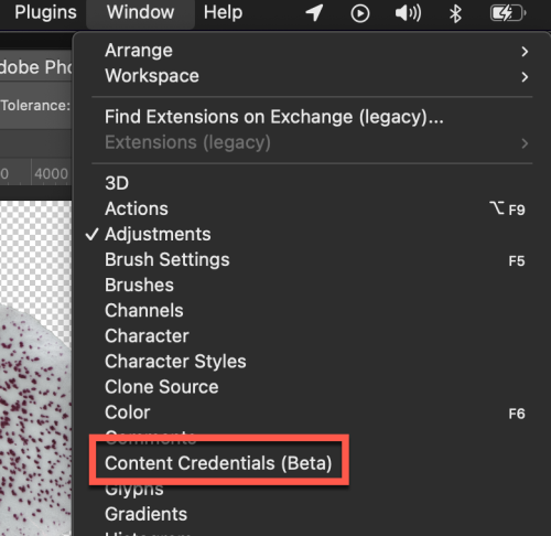
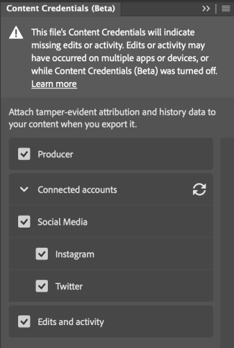
If you are using tools like Photoshop 2023 or Lightroom 2023, new capabilities exist to help with content. For our purposes, let’s use Photoshop. First, one needs to enable this beta capability. From the main menu, select Window > Content Credentials (Beta).

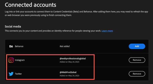
You then enable content credentials and link to your social media accounts. In this case, I have linked both our Twitter feed and Instagram feed. This provides and identifies references for individuals viewing your work.

One can also choose to publish your content credentials to the cloud. The alternative is to attach them to your files (which would increase the file size of each file). When you refresh the Content Credentials panel, one would see the linked accounts in Photoshop.

When you work with images, you can then preserve the content credentials as part of your file saving/exporting process. In this case, I removed the background from one of my orchid photos (generated by stacking a number of images together). Before exporting, these are some of the data one can include.

Ok, content credentials are now in the meta data. Now what?
Inspecting images
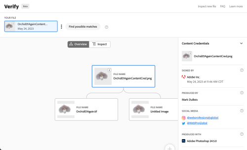
Perhaps one encounters the stacked image of an orchid online. We all know it is not possible to take a macro photo of a flower with such detail unless there has been some manipulation. One can use a tool like Verify (at the Content Authenticity Initiative site) to learn more about the image. Note that the image is being examined on your local computer (and is not being uploaded during this checking process). This is what I see when I examine the orchid image.

Note that there is recognition that there have been prior edits to this image (before the CAI was activated). However, one can also see the additional information. In addition to the inspection tab, there is an overview (for those who like to see the origins).

Of course, that was an overview of my efforts working with actual images. What about AI-generated images?
AI and C2PA
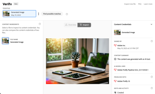
Tools (like Adobe Firefly) utilize open-source tools (C2PA in this case). If you follow the link to C2PA, there is an introduction video. Without going into all the weeds, here is what one sees when testing the content authenticity of a Firefly-generated image. Note, there is no visual overview as this was just machine-generated. One can clearly see the origin of the image.

Perhaps the CAI will help us better deal with the wave of misinformation being generated. Time will tell. In the interim, we encourage you to try out these open-source tools. As always, we are curious what you think. Let us know in the comments.

by Mark | May 8, 2023 | AI and Machine Learning, Industry News, JavaScript
April has been a very busy month at Web Professionals Global. In addition to running the SkillsUSA national web design and development competition, we have been helping more and more states with their statewide web design and development competitions. This year we connected with a significant number. We provided the contest assets (including a work order), a coding environment, judging rubric, and associated videos to help both competitors use the online environment and judges review the work of competitors. This means our monthly update on what is happening in the world of the web is running a bit late.
Here are some of the articles we found interesting. We hope you enjoy learning more about what is happening. As always, we are interested in learning what you are most keen to learn about. Please add a comment and let us know. Here are some categories for the articles we found interesting. As mentioned in previous posts, all links will open in a new browser window/ tab.
- AI and current uses
- Browsers
- JavaScript
AI and current uses
You will note there is a featured image associated with this weblog post. In the past, this was manually generated (using tools such as Adobe Express or similar). The image this month was generate from a test entry describing to Adobe Firefly what was desired. In this example, I entered text asking for a photo of a desktop with an open laptop, an open notebook, pens and pencils on the desk and blooming orchids. The result is what you see. It was generated in under 10 seconds. Yes, AI saves time.
We have also been using AI to generate the client assets for our web competitions. Logo creation, text content, and more are all generated using AI (which saves us considerable time).
As an organization, we support the recently formed Content Authenticity Intiative. We encourage readers to follow the link to learn more about this important initiative.
Browsers
It appears Google is considering updating the venerable padlock depicting SSL sites.They are considering a variant of the tune icon. Read more about it on the Chromium blog. They present a solid rationale for making this change. For example, only 11% of those surveyed really understood what the padlock meant. As they mention, even the FBI mentions the lock icon is no indication of website safety. We are curious as to your thoughts about this change. It appears this will be coming to a Chrome browser near you one of these releases. Let us know your thoughts in the comments.
Speaking of browsers, in case you missed it, April 30 marked the 30th anniversary of the licensing of the web for general use and at no cost. 30 years. WOW. Yes, that was a pun.
One more article you may find of interest – the calm web: a solution to our scary and divisive online world. Karolina Szczur provides many thoughtful insights. She also offers practical ways one can get started. For example, stripping away unnecessary code and removing low quality content.
JavaScript
Although this article is over a year old, it might be worth reviewing (and pointing this out to aspiring web professionals – perhaps those you teach). A web components primer seems a good introduction to the topic. For those of you teaching web technologies – do you discuss web components? Why or why not? What are your thoughts about this article?
Your turn…
That is a quick overview of some articles we found intriguing. We hope you enjoy them as well. What did you find helpful? What would you like to learn more about? Please tell us in the comments.

by Mark | Apr 28, 2023 | Profiles Of Success, Web Design
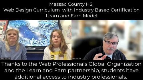
We love to take moments to brag. Today we are boasting about a web design program at Massac County High School in Metropolis, IL. Penny Allen is one of our newest teachers, and already she is knocking it out of the park. Penny has a number of students who will be receiving their industry credentials this year. The first course completer is Nick Proctor, who is a newly minted Certified Web Designer Apprentice (CWDSA-apprentice). He is the first high school student in the state of Illinois to do so with the new Learn and Earn program. We are proud to welcome Nick as one of the newest members of Web Professionals Global.
As if that isn’t already enough, Nick has already designed the website for a local bakery, Miranda’s Delight. The Web Design certification process helped teach him the skills to build the site and he is now taking the website to the next level by consulting with search engine optimization (SEO) experts to learn how to get more people to see his site while searching online. Students like Nick are “future-proofing” themselves with international industry-recognized certifications from Web Professionals Global that they can take with them into their future educational and professional endeavors. With the changing world of work, having certifications to set yourself apart is more important than ever before.
Nick is a great example of the Learn and Earn model, in which industry professionals have underwritten certification costs for students around the country. Instead of teaching to a test, the Web Professionals Global approach is to teach learners by enabling them to gain real-world experience and build a portfolio they can take with them. Nick is developing a professional portfolio and already having an impact in his local community.
One of the great aspects of web design is that it is a growing and stable career field, and many designers work on their own. According to the job site Zippia, there are over 21,000 freelance web designers in the U.S. The growth rate of web design between 2021 and 2031 is expected to be 23%, far above the average rate of 5% for other professions.
We caught up with Nick and Penny to hear about their experiences with the Web Design course and certification.
Hear from Nick
What attracted you to wanting to be a web designer?
Well, really I think it was this class. I had never really considered web design until I started taking this class this year. It was always something that I was sort of interested in because I’m also really interested in graphic design and like video production. And I feel like those three kind of fall under the same category of creating things online. And this is probably the easiest form for me, because I’m not the most creative mind, I guess I’m a lot better at taking instruction and then putting it out on a piece of paper. And that’s kind of what this is, with graphic design. I really enjoy it and have fun with it. Although I don’t necessarily have an artistic mind, for some reason web design just comes naturally to me.
How do you feel about the idea that you’re actually earning industry credentials right now in high school?
It’s honestly kind of surreal, because I never assumed that I could, I guess achieve something like this while I’m still in high school. It seems like something that is out of reach for a high schooler, and then to have that opportunity and be going through it right now is really strange but cool.
How exciting is it that this certification has helped you realize some of your goals?
I think it’s really exciting. I’ve been trying to do this for years but never had success until now. So being able to work with a client, build the website and get a site host and then have a complete site is really cool. Having the certification is great because I can carry it with me in my future.
What was it like hearing from industry professionals?
Oh yeah, in the lessons the professionals really clarified a lot of the things that I was really confused about. And I think hearing advice from people who do this in their daily lives is really great. Obviously teachers help a lot, but sometimes you want to hear from people who actually work in that field. And hearing from multiple people gave me different perspectives on different concepts as well.
We hear that you’ve already started your web design business. Is that true?
Yeah, I’ve actually just finished my first client. I’ve published that website, actually, and it’s up right now. I am struggling with the SEO right now. I’m not exactly sure how search engine optimization works at the moment. But I’ve been researching that a lot today and yesterday, and I’ve got it published, I just need to get it out there really, for people to search it.
What do your parents think about the fact that you’re getting a certification while in high school?
They’re actually really impressed with it, because I guess I hadn’t properly explained to them that I was getting certifications until a couple months ago. I just kind of walked in the house with the certification. And my mom was like, where did you get this from? And I was, Oh, it’s my web design class that I’ve been taking for a couple months now. And I think she’s just really proud of it because I guess she didn’t know that my school offered something like that either. As far as I know, we don’t have other certifications offered at the school.

Hear from Penny
What does it mean to you to get your students “future-ready” (certifications, more than just tech skills, etc.)?
This certification gives students a way to make money now and not have to wait until they graduate. Most college students have to work in lower wage jobs while going to college and work long hours during the evening or late nights. This certification will give them the freedom to work when they want, making much more money while going to school.
What do you think of the Learn and Earn Model?
When I introduced the idea of the Learn and Earn model to my students, we talked about how industry professionals were going to underwrite the cost of the students receiving their certifications if they worked hard. I asked my students what they thought about the idea of doing the work and projects in lieu of an exam, and they agreed and said it was a better idea. With an exam they could just memorize a bunch of ‘stuff,” pass the test, and then immediately forget it all. However, this model means they actually have to learn it and use it! This encourages them to remember the material. We are all thankful to the partnership between Web Professionals Global and CTeLearning for this opportunity.
Become our Newest Member
Whether you are a teacher looking for industry certification opportunities for your students, a student in high school looking to advance your career prospects or a working professional seeking to develop new professional skills for a career change, we can help. Our international industry-recognized certifications prepare learners for in-demand 21st-century careers. Contact us today to chat about how we can help.

by Mark | Apr 10, 2023 | Member Profiles, Web Design
We recently received a message from Amy F., one of our Web Professionals Global members who used her Certified Web Designer Associate (CWDSA) certification to land a job with the leading company in North America that supplies sustainable steel products to construction and green energy fields. Let’s hear from Amy:
“Hi all, I am doing well! I used my Web Design certification to get hired at Nucor. I’m learning BIM (building information modeling) and steel detailing. I’m very grateful for the opportunity I had to earn my Web Design certification. I know getting my certification helped me tremendously to get my job and thrive in my new role!”
We are so proud to have helped Amy land a job that is utilizing her Certified Web Designer skills. Amy also earned our Remote Working Professional Certification, so she is ready to work either remotely or in a hybrid model. Amy is an example of how Web Professionals Global certifications prepare web professionals for exciting career pathways. Our membership includes students who are planning for their professional futures, working professionals who are developing new skills, and those who are making career changes. Again, congratulations to Amy. We look forward to following her career and welcoming others like her into our organization.
To learn more, below is the original Q&A blog article we did with Amy back when she first earned her Certified Web Designer Associate and Remote Working Professional certifications.
Today we are highlighting Amy F., one of our most recent Web Professionals Organization certification recipients. She earned her Certified Web Designer (CWDSA) and Certified Remote Working Professional (CRWP) certifications as well as an Ethics in the Workplace microcredential, all from the comfort of her own home. She can use these credentials and her robust portfolio of web design projects in future interviews with potential employers or as a base to launch her own business as a freelancer.
MyCAA—also referred to as the My Career Advancement Account— is a program that provides tuition assistance for courses and certifications to military spouses. Amy was able to utilize the MyCAA program, and we are proud to be associated with this program that helps military spouses succeed. We have worked with countless military members and spouses over the years to help them earn certifications, and they are always among our most driven and hard-working students. As a military spouse, Amy is a great example of why we offer online certification programs.
We caught up with Amy to ask about her experience taking courses and earning certifications as a working professional.
What initially attracted you to web design?
Coding reminds me of math in a way! The beauty of math is that it’s either right or wrong. I love that! As I learned about coding, I realized it has operations of its own, a set of rules that need to be followed. I find that relaxing.
As a military spouse, what did you enjoy about being able to complete the courses and certifications fully online?
I really appreciate that this class was fully online! I also liked the schedule flexibility as well as the ability to work on the certifications at my own pace and from wherever my husband and I were stationed at the time. We underwent a permanent change of station (PCS) move while I was in the middle of the courses, and I was able to continue working seamlessly.
How has taking the Remote Working Professional course and earning the certification empowered you as a working professional?
I’m fortunate that this course also offered a Remote Working Professional (RWP) Certification. I’m excited about the future and the jobs I will be able to get now that I have a RWP certification. I plan on working remotely so that I don’t have to look for work each time my husband and I change locations.
How has the Remote Working Professional course and certification changed your view of global connectivity and people being able to learn and work remotely from anywhere?
I love the fact that I can work for a company based anywhere in the world.
What skills did you learn in the Remote Working Professional course that you would share with a hiring manager in a job interview?
I learned a number of skills. To name just a few:
- Communication: well-mannered verbal and non-verbal communication as well as sending post-meeting recaps to avoid miscommunication are important.
- Organization: using a planner and setting a timeline.
- Ethics: adhering to commitments, showing empathy, and being respectful, honest, transparent, and accountable.
- Initiative: doing the job right and on time.
- Preparation: being ready for technology failures.
- Cultural sensitivity: understanding different cultural norms by researching before engaging.
- Cybersecurity: how to maintain safety and privacy.
How has your experience earning these certifications improved your confidence in being able to work from anywhere as a military spouse?
My mom and dad always tell me they’re proud of me…but that’s their job. I took the courses and earned the certifications so I could be proud of myself.
What advice would you give to others who are considering earning certifications to future-proof their careers?
The same advice my mom gave me: “The time is going to go by anyway!”
The internet, business, and marketing are all closely intertwined together—how do you think the courses and your new certifications will fit into your future plans as you go on to finish your business degree?
I will be graduating with my BBA this summer (woo-hoo)! Through my education I have earned experience, skills and qualifications that show I am capable of learning. After this summer, I plan to use my degree and certifications to land a nice job!
Mark DuBois, Executive Director of the Web Professionals Organization, said, “Amy is another great example of a MyCAA success story. I am proud of our military leadership for thinking about the whole military experience—not just for the service person, but for their spouses and families as well. I think it is a brilliant idea that we, as a country, invest in educational opportunities for military spouses. Our servicemen and servicewomen and their families sacrifice to maintain the security of our nation. Helping spouses gain marketable web technology skills so that they can move as duty requires helps make the family unit stronger and more resilient. MyCAA is money well spent. Everyone who has been a part of this program who has gone through the education and received certifications from us has been exactly the type of person employers want to hire. Congratulations again to Amy. We thank Amy and her husband for all they are doing to contribute to the safety and security of our country.” If you would like to earn certifications and learn skills that can make you a more marketable professional, check out our certifications list and contact us today. We would love to chat with you.


