by Mark | Aug 31, 2018 | Web Security
Another week, another data breach
As we develop web sites and APIs, we need to keep security in mind. I know this is obvious, but it is also something often overlooked. It is not glamorous. It is not something that has perceived value by many in management. That is, until there is a security breach and associated bad publicity. Security vulnerabilities come in many different guises. Many have one thing in common – they were addressed many years ago. Yet, we often keep making the same mistakes on sites. We know how to fix many of these. We simply have not forced the idea that security must be incorporated into all our work processes. Just look at the OWASP top 10 vulnerabilities. Sure there are differences between the 2013 and 2017 versions, but there are many similarities as well. Cross site scripting remains a threat (as does SQL injection and many other vulnerabilities).

We all need to be thinking about security as we develop web applications. However, those teaching application development need to stress this in every project assigned. Unless security becomes ingrained in our application development process we will continue to repeat the mistakes of the past. And. Data breaches will continue.
(more…)

by Harshala | Aug 24, 2018 | Uncategorized
What is World Wide Access or Accessible Web Design?
The World Wide Web has rapidly become the dominant Internet tool, combining hypertext and multimedia to provide a network of educational, governmental, and commercial resources. Because of the multimedia nature of the web and the poor design of some websites, many Internet users cannot access the full range of resources. Some visitors cannot see graphics, cannot hear audio, cannot operate a mouse, uses slow Internet connections and modems or equipment that cannot easily download large files, or have difficulty navigating sites that are poorly organized with unclear directions because they have learning disabilities, speak English as a second language, or are younger than the average user.
What is Accessible Design?
Accessible design is a design process in which the needs of people with disabilities are specifically considered. Accessibility sometimes refers to the characteristic that products, services, and facilities can be independently used by people with a variety of disabilities.
The World Wide Web Consortium (W3C) develops and maintains the protocols used on the web to insure interoperability to promote universal access. The W3C’s Web Accessibility Initiative (WAI) has proposed guidelines for all web authors.

(more…)

by Harshala | Aug 17, 2018 | Content Strategy, Web Content
What is Information Architecture?
Information architecture is the practice of deciding how to arrange the parts of something to be understandable. It is in the websites we use, the apps and software we download, the printed materials we encounter, and even the physical places we spend time in.
A good Information Architecture helps people to understand their surroundings and find what they’re looking for – in the real world as well as online. Practicing information architecture involves facilitating the people and organizations we work with to consider their structures and language thoughtfully.

Information architecture (IA) focuses on organizing, structuring, and labeling content in an effective and sustainable way. The goal of IA is to help users find information and complete tasks. To do this, we users need to understand how the pieces fit together to create the larger picture, how items relate to each other within the system.
As many students (and teachers) begin a new term this month, we thought it would be helpful to review some of these fundamental tenants. It is always a good idea to focus on the basics and make certain we have a solid foundation.
(more…)

by Harshala | Aug 10, 2018 | Content Strategy, Semantic Web, Web Content
What is Semantic Markup mean?
Semantics is the study of language meaning – the words used to communicate. Semantic markup should be used in web pages we create and modify.
In our technology world we use semantic language. Semantic HTML is the use of HTML markup to reinforce the meaning of the information in webpages and web applications rather than merely to define its presentation or look. Semantic HTML is processed by traditional web browsers as well as by many other user agents.
For HTML it is the tags we use to mark a document up. Markup is how a web document is created, or the way you write a document using the language available to you. For most web documents this is still HTML, so it is how you write the content you want to display using HTML.

(more…)

by Harshala | Aug 3, 2018 | Employment Issues, Job and Resume Tips from the Pros
What work skills can make you more marketable to employers in 2018?
Change is always constant. So naturally, the job skills that employers look for in new hires change from year to year. It’s one of the best ways for companies to stay competitive and ahead of the never-ending curve. According to Julie Friedman Steele, board chair and CEO at World Future Society “The workplace moves rapidly and employers need workers who stay current.” That means you need to consistently improve your skills and develop new ones.

Here are 7 work skills most employers look for –
- Problem solving
- Data analytics
- Social media literacy
- Creativity
- Resiliency
- Good business sense
- Willingness to learn
This list comes from a good article covering 7 work skills which make you more marketable to employers in 2018. Note that most of these relate to non-technical skills. Those are assumed these days.
(more…)

by Mark | Jun 8, 2018 | State of the Web, Web Design, Web Development, Web Pro Education, web standards

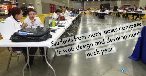
In a couple of weeks, we will be holding our 15th national web design competition in Louisville, KY. This involves competitors from many states at both the high school and post-secondary level. We spend a significant amount of time and money every year making certain this competition happens. Why do we do it? Sure, this is an opportunity for competitors to showcase their best work. It is also our opportunity to reinforce industry “best practices” in a field which is constantly changing. The main reason we do this is that we are influencing (and improving) the careers of these competitors.
Many changes made to our 15th annual competition
We have made a number of changes in our web design contest this year. For example, we will be bringing a server and network to Louisville. Competitors will each have their own container on the server (a sandbox where they can showcase their work, but other competitors can not see their work). Judges will be reviewing competitors work on Wednesday and Thursday evening. We have outlined both our server environment and network on our Web Design Contest site.
We are helping students prepare for jobs in our field
No, really, why do we do this? To paraphrase the old question “how do you get to Carnegie Hall? Practice, practice, practice.” Over many years, we have observed that many students struggle to identify and learn what is important in web design and development. Many do not have the opportunity to take formal classes (this is especially true in nigh schools). In some cases, when formal classes are offered, the materials covered are outdated. By participating in this competition, students learn what is expected in today’s business environment (with respect to web design and development). Practice is important along with the need to test your knowledge and skills against others. Competition brings out the best. Students are exposed to a formal interview (by practicing web professionals). We provide hours of training before the competition on many aspects of web design and development. In many cases, this is one opportunity that students have to interact with web professionals and learn what will be expected of them. While our time with competitors is brief, we do help them better understand what is happening in the industry today. Sure, technical knowledge is important, but process, teamwork, communication and related “soft skills” can make all the difference when dealing with clients. this is why we stress these aspects as well.
We are what we do. And how often we do it. And how we respond to feedback and suggestions for improvement on our work. These students have decided they want to pursue a career in web design and development. By focusing on current practices with web design and development, we are reinforcing knowledge and skills that students need to succeed in our industry. Students also have an opportunity to test what they think they know and see how it stacks up against others throughout our nation. This is why we do this competition every year. It is our opportunity to affect the lives of aspiring web professionals and get them started properly. Sure, there can only be one winning team at the high school level and another winning team at the post-secondary level. But every team participating is exposed to rigor and concepts they may not receive elsewhere. Every participant gets the opportunity to showcase their skills and knowledge.We often receive feedback after the competition that it was a lot of fun and a great learning experience.
International competitor also being chosen
We are also selecting a competitor to represent the U.S. in the next international web design and development competition (to be held in Kazan, Russia in 2019). In order to be considered for this honor, these competitors had to first win our national competition and were involved in a lengthy selection process. Two finalists will be competing in Louisville. One will be selected to represent the U.S. at WorldSkills 2019.
We bring a number of web professionals from different parts of the U.S. to Louisville to help run the two day competition (and provide an additional day of training). We also have judges reviewing competitor work remotely. All projects are uploaded to a web server and judges review aspects of this work with an emphasis on their expertise. For example, we have judges who specialize in UX/UI focus on those aspects on projects submitted by competitors. We have judges focus on graphics, type and related aspects and so forth. Competitors receive general feedback as to what they did well and those areas where they need to improve. In many cases, this is the only feedback they have received on their work.
Good, fast, cheap – pick any two
During our competition, we ask competitors to focus on getting things done quickly. We also ask they spend time creatively solving the problems presented. While we are not always successful, we try to focus on doing things the correct way (including comments in your code and properly naming variables, for example). Sure, it will take a little more time up front, but competitors will be able to submit work which is easier to maintain. Rather than spending money, competitors spend a more valuable resource – time – to complete the work orders they receive.
Comments and observations will be posted on our Web Design Contest site soon after the competition concludes later this month. We will be posting via social media channels during the event.
Are you willing to help our profession?
For those reading this, we are always in need of additional judges. It only requires a few hours of your time. You get the opportunity to see directly what high school and post-secondary competitors are capable of producing these days. You also have the opportunity to provide general feedback to these competitors (and many others reading your summary comments). If you are able to devote a few hours of your time on the evenings of June 27 and 28, please contact us. You will be amazed at how greatly a little of your valuable time helps aspiring web professionals become more successful.
Best always,
Mark DuBois
Community Evangelist and Executive Director

by Mark | Jun 1, 2018 | Industry News, webprofessionalsglobal.org News
We suspect you have received more than your share of GDPR related notifications in the past couple of weeks. Rather than send out another email on the subject, we thought it might be worthwhile addressing the issue in our weekly post. You have thoroughly reviewed every email you received with GDPR in the subject line, haven’t you? We thought not. For those who are not familiar with GDPR (General Data Protection Regulation) [which took effect May 25, 2018], we recommend a quick review of the GDPR and you site. For those who need a reminder – Web Professionals (official business name World Organization of Webmasters) does not retain much in the way of personal information to begin with. We always take requests regarding data seriously and make every effort to keep said data secure.

Minors
If you are younger than 18 years, please use this website only with permission (and active involvement) of your parent/ guardian. Do not provide any personally identifiable information (such as your email address). Have a parent/ guardian contact us on your behalf when necessary.
Information we collect
As with many websites, we collect basic information about all visitors. This may include the date and time of your access, your IP (Internet Protocol) address, the website you visited before arriving at webprofessionalsglobal.org and the website you go to when you leave our website. We track your operating system, screen resolution, and browser details. This is automatically collected. Such data is only used for high level analysis (unless you are trying to hack our website – in which case, such information will be provided to appropriate law enforcement).
We may use cookies and local storage to keep track of your session on our website. You can disable this in your browser if you do not want to have a customized experience when you visit our site.
You may initiate transactions on our website which involve credit cards, debit cards, online payment services and similar financial mechanisms. During those transactions, we will collect some information (such as your email address) and billing address so we can contact you in the event of questions. We do not store your credit card details (only a transaction code).
What we do with your information
We use the information collected to run our business. For example, we periodically send email news to our members. We use the email address you provided when signing up as a member to accomplish that. We do not provide customer data to third parties without your permission. You always have the option to opt out of any of our mailings.
There is one exception. We may (at our discretion) provide your information to law enforcement (or related government agencies) in the event of fraud investigations or other suspected illegal activities.
Login Credentials
Members create a username and password to access some restricted areas of our website. We recommend periodically changing your password (and keeping it long and complex). Your password is encrypted in our data stores and backups. We have no way of telling you what your password is. If necessary, we can issue you a new one (once you have properly identified yourself).
We also recommend logging out when you are finished reviewing that part of our website. If you are extremely concerned about this, we also recommend closing your browser when you leave our site.
Questions
If you ever have questions about what we do with any data collected or wish to have personal information removed from our data stores, please contact us.
As a member supported (and not for profit) organization, we take our responsibility to safeguard any information you provide as safely as possible. We have not (and will not) sell any of this collected information to any third party.
Best always,
Mark DuBois
Community Evangelist and Executive Director
by Mark | May 25, 2018 | Content Management Systems, Web Security
Today’s article is from our member Julia Eudy. Julia – Many thanks for writing this article and providing your insights.
When I think of the industry of web design, I think of the many talented people responsible for populating the internet with information over the past couple of decades. But our job is never done! From continual refinement of responsive design, to developing content worthy of Google’s latest search strategy; our jobs as designers and web managers is an ever-evolving landscape. In today’s market it is essential to stay current with technology and the threats targeting those we serve and those who search online. Without constant awareness and action by our peers in technology, cybercriminals will continue to challenge our time, patience, and livelihood.
Websites have become Key Point of Attack for Cybercriminals
While many believe that email phishing is a key entry point for most cyber criminals, it has become apparent that they are often using an unsuspecting website to hide their activity of malware designed collect valid emails and launch other criminal schemes. While some argue that nothing is hack-proof; content management systems built on open-source code have enabled the unsecure environment we now reside. It goes without saying that sharing code saves time; but is it worth the longer-term cost?
Let’s explore the leading CMS platform, WordPress. It is an easy-to-use interface making it popular among novice developers and DIY professionals, but it is often a prime target of hackers who specifically build robotic scripts designed to quickly search through the openly published source files looking for vulnerabilities. Technical web designers (those who know how to customize the code and apply advanced security settings) understand that keeping current on updates and effectively managing a recovery plan for the sites you have created has become a time-consuming task and one that is raising the overall cost of website management. However, the millions without some technical skillset, have likely already become an unsuspecting victim to one of the many ongoing threats facing the WordPress community.
A prime example of how open-source code created a breeding ground for a cyberattack happened in early 2017 when one of 20 hacking groups launched a digital turf war on WordPress by discovering a flaw found in their REST API script. A wide-spread attack impacted roughly 1.5 million pages of WordPress sites1 across 39,000 unique domains in a matter of days as reported by security plugin developers WordFence and Sucuri. Keep in mind that only 1.5 million of the 24 billion pages running WordPress2 are protected by these firewall applications.
Insurance Companies are Looking at Who to Blame for the Increase in Commercial Claims
From the outside looking in, the internet landscape is under attack, but who is to blame? This is a question many insurance companies are beginning to ask3 as their costs to cover cyber-attacks on commercial policies continue to rise.
Looking at a big picture, here are some general facts to consider…
- According to the Small Business Administration, there are approximately 28 million small businesses in America which account for approximately 54% of all sales in the country. 4
- In a 2017 report by Kaspersky Lab, the average cost for a data breach against a small and medium-sized business in North America was $117,000.5
- An article published in 2017 by INC Magazine, referenced a presentation made at the NASDAQ by Michael Kaiser, the Executive Director of the National Cyber Security Alliance, who stressed concerns about the attack on Small Business and that such attacks are expected to continually rise because of their (the small business professional’s) lack of awareness of the pending risks.6
- A 2016 study performed by Ponemon Institute LLC and Keeper Security revealed that the number one type of cyber attack targeting small and medium sized businesses was through a web-based attack with the web server being the most vulnerable entry point.7
- That same study by Ponemon Instutute cited “negligent employees or contractors” as the root cause of the data breach. 7
So, I ask you, when the Insurance companies follow the facts, who do you think they will turn to recover their loss?
- Will it be the random person who pointed out their vulnerability by successfully holding their web presence ransom? – likely not. That person is too difficult for them to track.
- Will they blame the contractor who their customer hired to create their website? – Yes!
In recent conversations I’ve had with insurance professionals, one question asked was, “Should web designers have an ethical obligation to inform an untechnical customer of the risks involved with having a website?” As a technology professional, I agreed that they should and most likely do, but it is often the customer who elects to not add to their expenses for proper technical support. Their reply – “Ok, show me the proof and we go back to our customer!”
Most web managers are aware that being hack-proof is near impossible to achieve; however, as web professionals we are hopefully more aware and have taken necessary precautions to defend our livelihood. Contracts, authorized “opt-out” forms proving we’ve informed the customer of the risks, and building trusted relationships with supporting contractors are just a few first places to start; but having our own policies to cover mistakes and cyber threats should also be considered.
Like our other certifications, we are exploring resources necessary to develop a comprehensive training and security certification to help web developers stay current with different types cyber threats that they may encounter. This certification would identify specific areas that are being targeted and give the opportunity for continued training opportunities to learn more or improve your skills in specific areas. This certification would also classify you as a Cyber Certified Web Professional which will identify to those seeking a web services provider that you have participated in training that is designed to reduce their web-based risks.
If you are interested in learning more about this certification and the time schedule for training and certification release, please contact us and let us know your thoughts.
CITATIONS:
- 1.5 million pages of WordPress sites
- 24 billion pages running WordPress
- Insurance
- Kaspersky Lab
- INC Magazine Article
- Ponemon Institute/Keeper Security Study
Author Bio
Julia Eudy is a Technology Consultant with specialties in Online Marketing, Web Design and Cyber Security. She teaches Content Management Systems (WordPress) and Social Media Marketing at St. Charles Community College in Cottleville, MO, in addition to managing a small Online Marketing firm (Golden Services Group) that focuses on online marketing solutions for small-medium sized businesses. Additionally, she is working with a group of professionals to create a training program designed to inspire K-12 students to pursue careers in technology and cyber security.

by Harshala | May 18, 2018 | Industry News, Web Content
The Web continues to evolve. Recent projections indicate that virtual reality and augmented reality may soon become a major part of web interfaces. We thought it might be helpful to provide a quick overview of these technologies and provide additional resources about the potential impact on the web. As an aspiring or practicing professional, you should be aware of these technologies.
What is Virtual Reality?
Virtual Reality is the computer-generated simulation of a three-dimensional image or environment that can be interacted with in a seemingly real or physical way by a person using special electronic equipment, such as a helmet with a screen inside or gloves fitted with sensors.
Current VR technology most commonly uses virtual reality headsets or multi-projected environments, sometimes in combination with physical environments or props, to generate realistic images, sounds and other sensations that simulate a user’s physical presence in a virtual or imaginary environment. This Wikipedia article has detailed information about the technology and its applications.
What is Augmented Reality?
Augmented reality (AR) is a direct or indirect live view of a physical, real-world environment whose elements are “augmented” by computer-generated perceptual information, ideally across multiple sensory modalities, including visual, auditory, haptic, somatosensory, and olfactory. The overlaid sensory information can be constructive or destructive and is spatially registered with the physical world such that it is perceived as an immersive aspect of the real environment. In this way, augmented reality alters one’s current perception of a real world environment, whereas virtual reality replaces the real world environment with a simulated one. Augmented Reality is related to two largely synonymous terms: mixed reality and computer-mediated reality. You can find more information about this at this Wikipedia article.

(more…)

by Harshala | May 11, 2018 | Web Development, Web Professional Trends
Web Development Trends
In web development, the saying “the only constant is change” is very true. Web development is changing every second and 2018 is no exception. User expectations are growing and it is more important than ever to build digital experiences that are engaging, fun, and intuitive. Content needs to be accessible everywhere especially on mobile devices. In order to make that happen, new programming languages and frameworks are on the rise, extensions are becoming more compatible, and real time web apps are becoming more popular.

Web Development Trends You Can Expect in 2018
(more…)


